Category
Role
Tools
Team
Client
Rebranding Equitable Life’s digital experience(s)
Equitable Life of Canada is a mutual life insurance company. In 2023, it underwent a rebranding project that reimagined how it presented itself to the world through a renewed purpose, commitment to a mutual structure, focus on clients, and continued development of strong partnerships. All while honouring its heritage and the recognition it’s built since its founding in 1920. I was on the Stryve team involved in conceptualizing this new brand approach from its inception, contributing to the go-to-market strategy and assisting with ongoing rebranding initiatives, including updated marketing materials, refined messaging, and continued visual identity evolution. This experience gave me the insight and trust to lead Equitable’s rebranding strategy for user interfaces and experiences across various product lines and touchpoints. To accomplish this, I worked closely with their internal brand, UX, and development teams, helping to guide them through the complexities of this transformative process.
Challenge 1: Interpreting the new brand across digital experiences
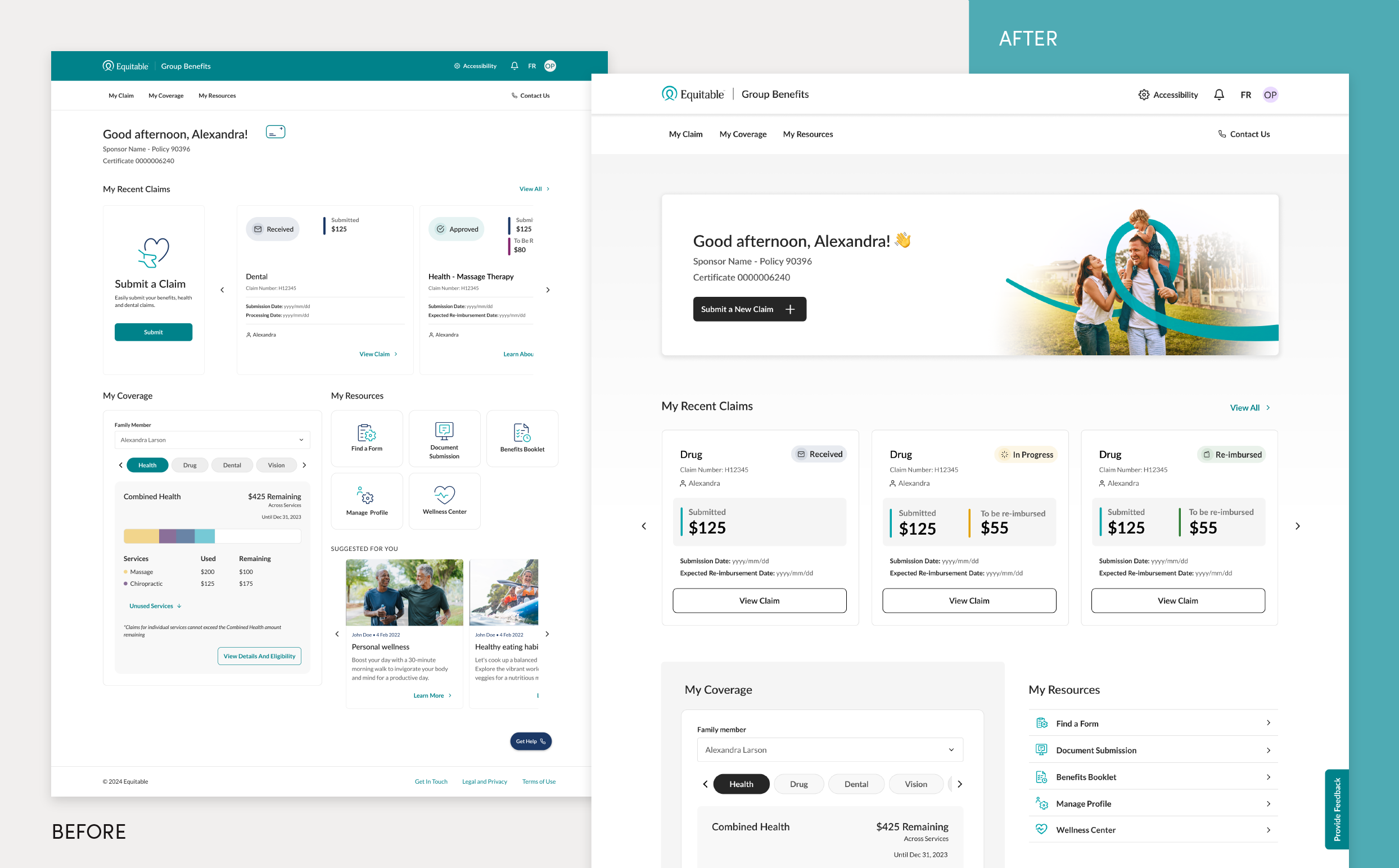
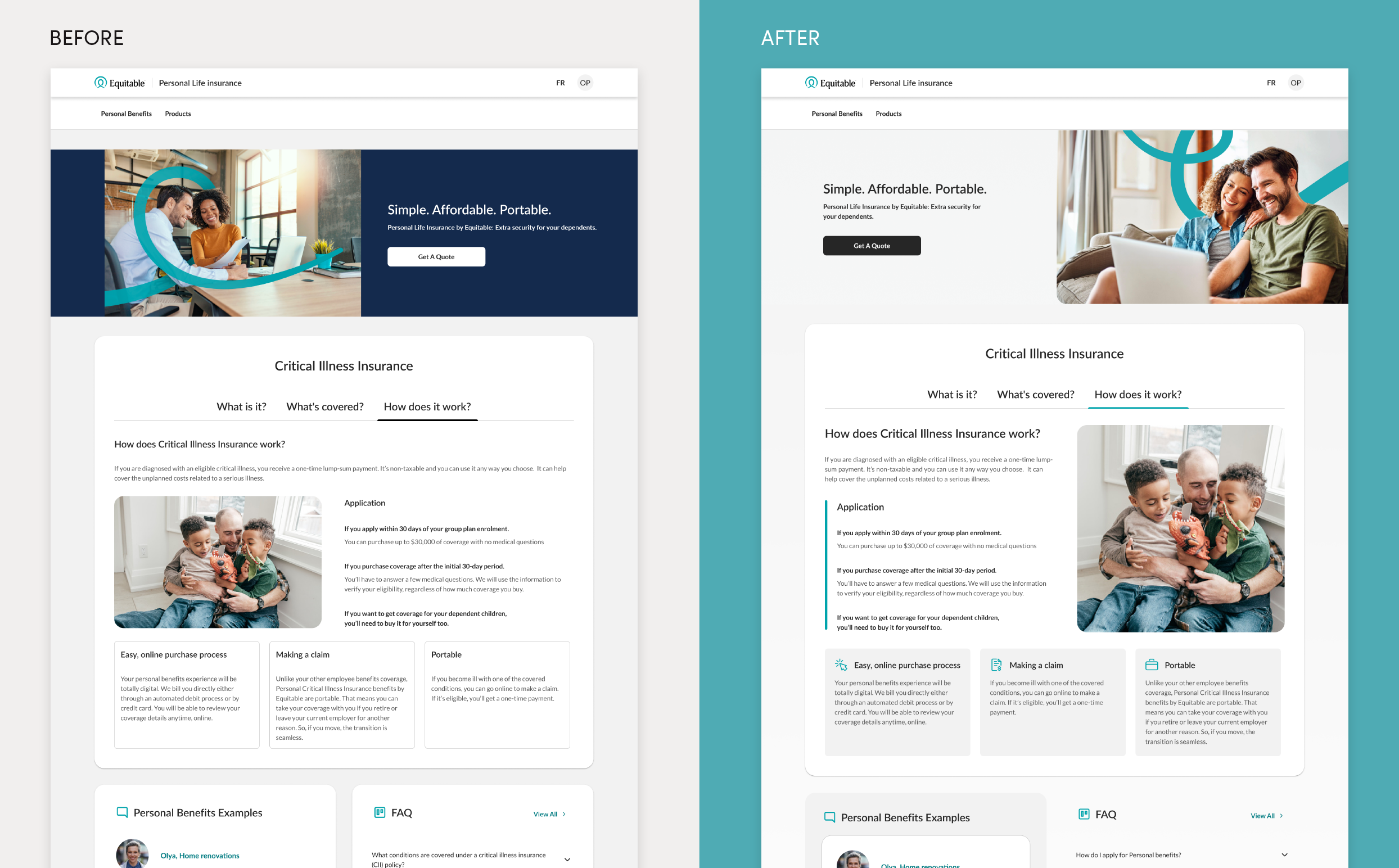
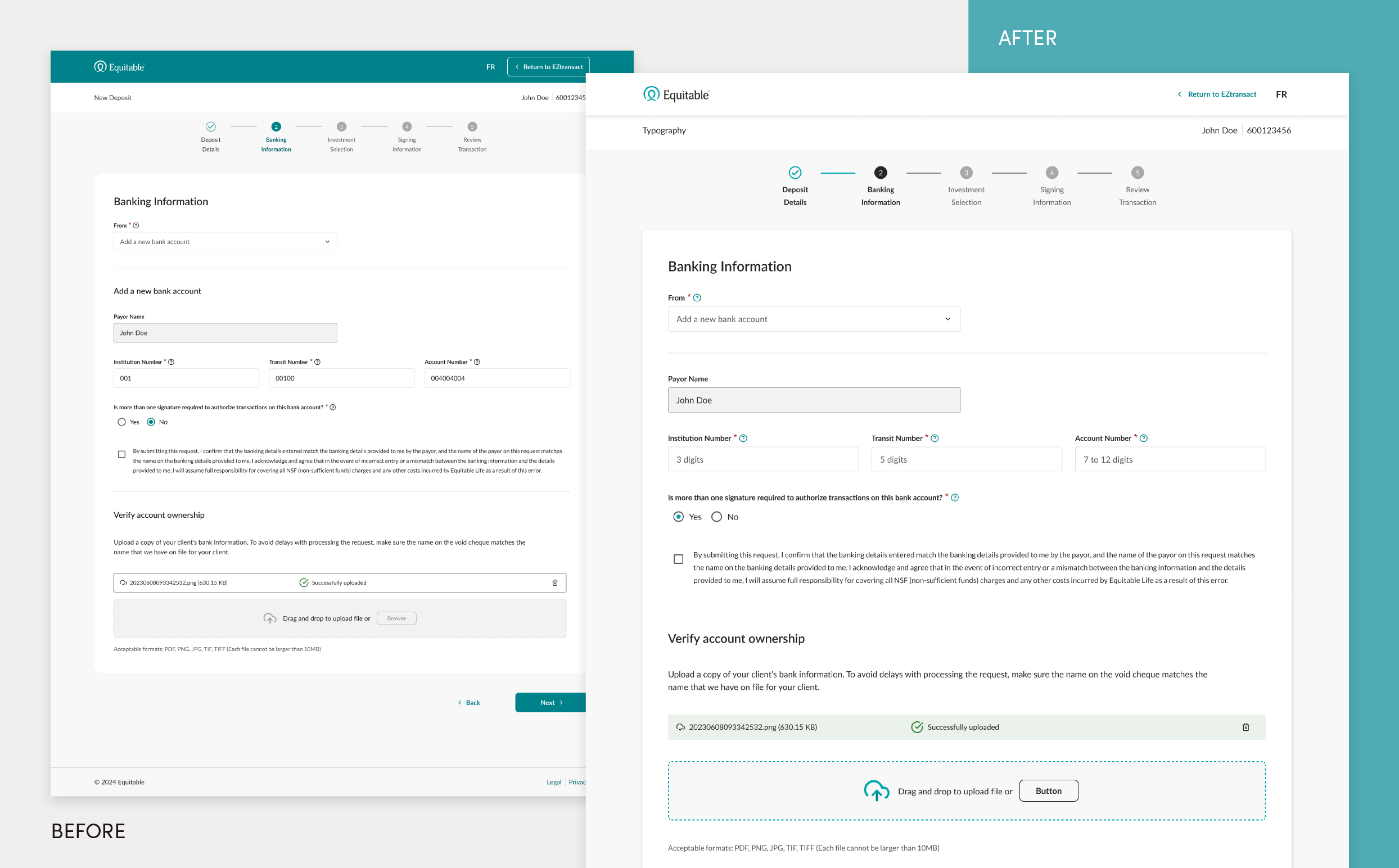
A key challenge was ensuring the new brand’s values—simplicity, guidance, and equity—were consistently reflected in all digital experiences. This meant interpreting the brand’s essence while introducing new design elements and colour schemes that adhered to these principles. I collaborated with Equitable’s team to help them understand the importance of brand consistency for recognition and retention. This included hands-on demonstrations where I redesigned and reimagined their work, showing how to apply the new branding through practice. For example, in a Group Benefits experience, feedback indicated users appreciated colour. However, using different colours for each banner wasn’t the ideal brand application. I demonstrated how strategically using colour through photography and iconography could maintain the desired vibrancy while adhering to brand standards. Aside from demonstration, I provide feedback and consulting on their user experience and interface designs to align them with brand goals on an ongoing cadence.
Challenge 2: Deploying the new brand efficiently across multiple interfaces
With numerous product lines and digital platforms, Equitable needed a phased rollout to avoid audience confusion. Together, we implemented a two-phased approach that allowed for brand continuity without sacrificing consistency. The first phase, a “colour conversion” project, involved updating all components and visuals to reflect the new brand colours and imagery, providing a swift and cohesive brand refresh across products not slated for an entire UX overhaul. The second phase involved a complete redesign of selected products, where the new brand elements and user insights were applied with greater nuance, ensuring a deeper alignment with the rebrand’s vision while enhancing user experience and engagement.
Challenge 3: Maintaining alignment across multiple teams and products
To ensure consistency across Equitable’s diverse projects and teams, I worked closely with Equitable’s UX team; we created a detailed UX/UI Playbook and Figma component library that set standards for every element of digital design, from colour hierarchy to typography, layout, and interactive components. These guidelines were foundational for implementing the rebrand consistently and provided flexibility for varied digital applications.
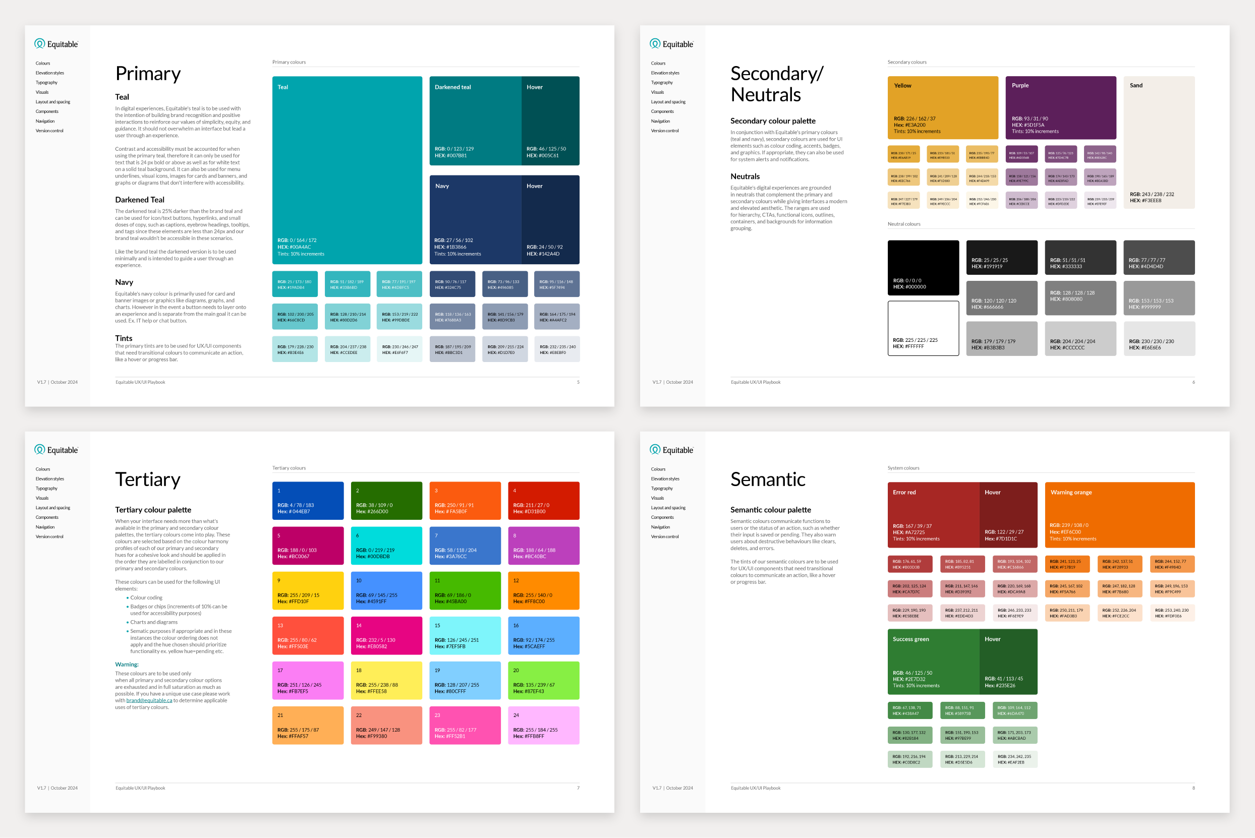
Colour hierarchy and accessibility
The Playbook established a hierarchy for Equitable’s colour scheme, emphasizing the brand’s teal as a primary colour used strategically in navigation, icons, and imagery to guide users. A 25% darker teal was introduced for smaller elements like captions, hyperlinks, and tooltips to maintain readability and accessibility, as the primary teal did pose contrast challenges. However, when used in these applications, it was harder to tell that these two teals are different, making them an ideal solution for building brand recognition and balancing accessibility.
Equitable’s secondary colours (navy, purple, and yellow) add depth and variety to elements and are reserved for UI elements like colour coding, accents, badges, alerts, and feedback, bringing clarity to system messages without distracting from the primary content. When a design or interface needs more than what’s available in the primary and secondary colour palettes, a complementary tertiary and semantic colour palette comes into play.
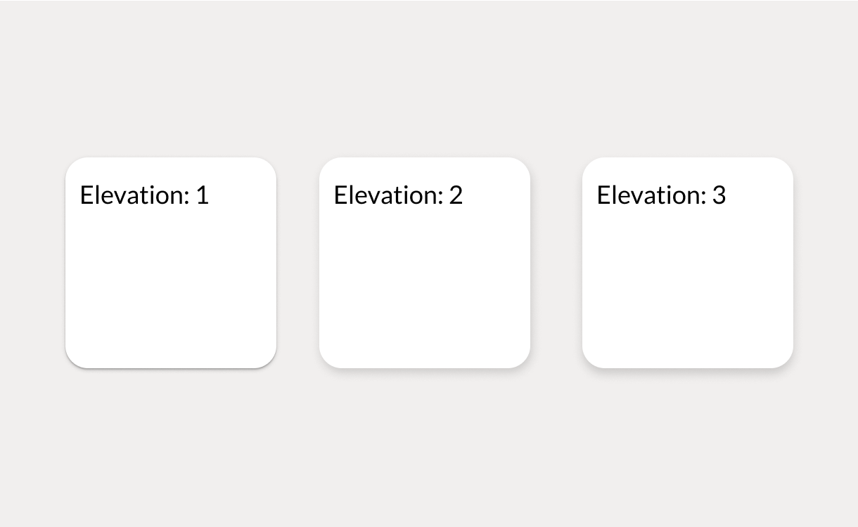
Elevation styles for modern, structured interfaces
We utilized elevation styles, including subtle drop shadows and structured backgrounds, to visually separate and group content. This added a sense of depth and hierarchy without overwhelming the user, creating a clean and focused interface.
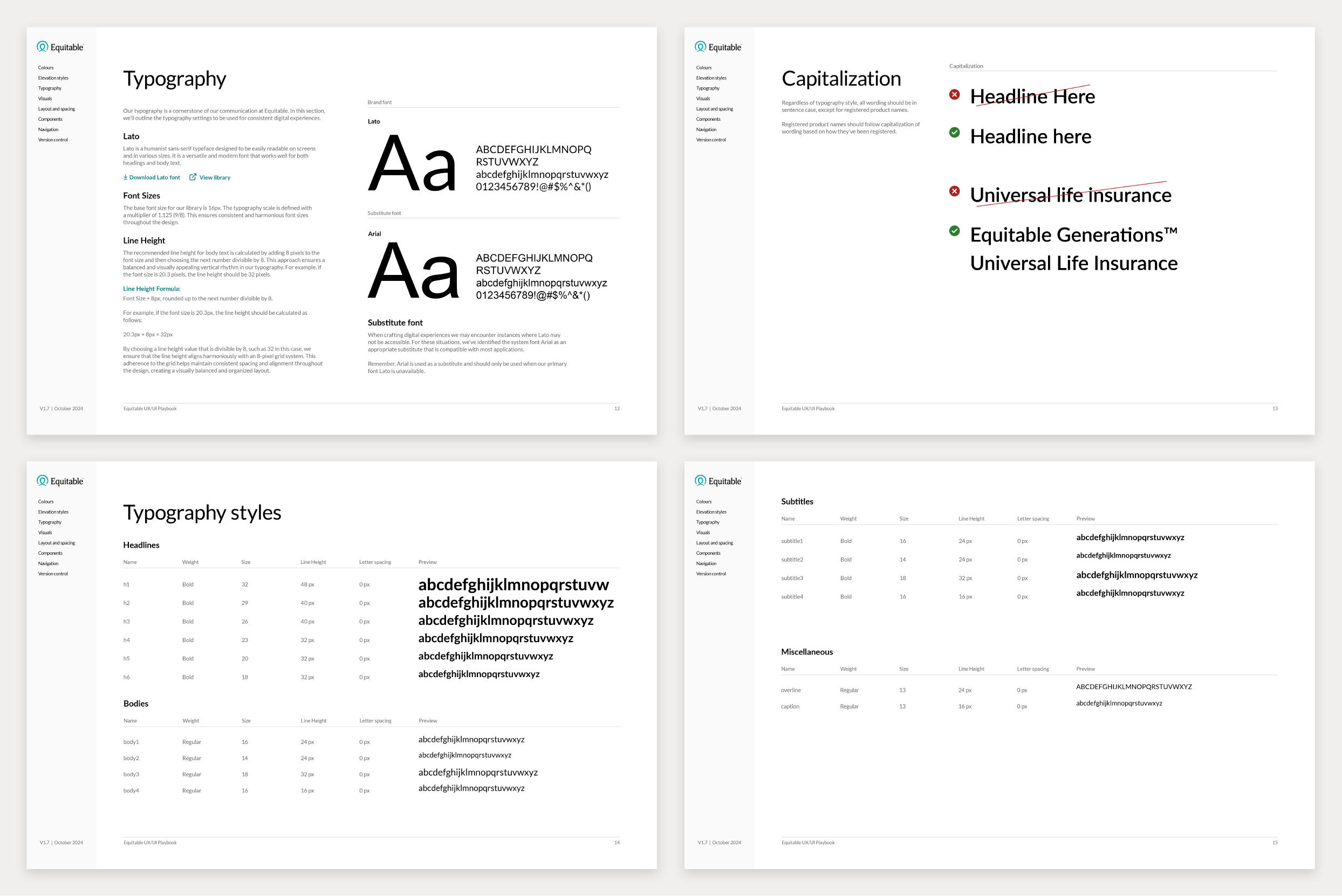
Typography and spacing for clear communication
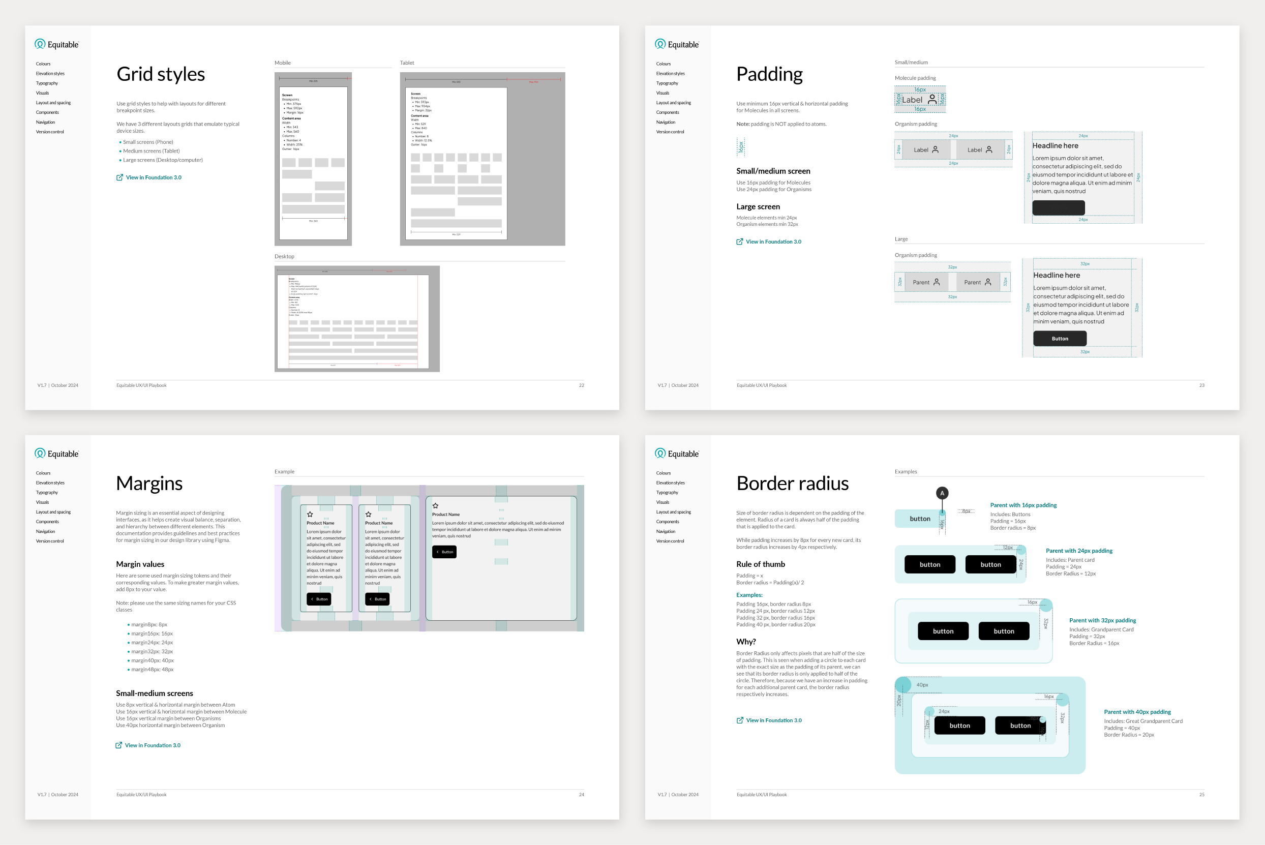
The primary typeface, Lato, was selected for its readability across various screen sizes, with a scale optimized for responsive layouts. The line height and spacing were aligned to an 8-pixel grid to maintain visual harmony, ensuring consistent vertical rhythm across components. Formatting structures for content and input fields were also established for scalability, and sentence case was applied universally to emphasize a warm, approachable tone.
Interactive elements and component design
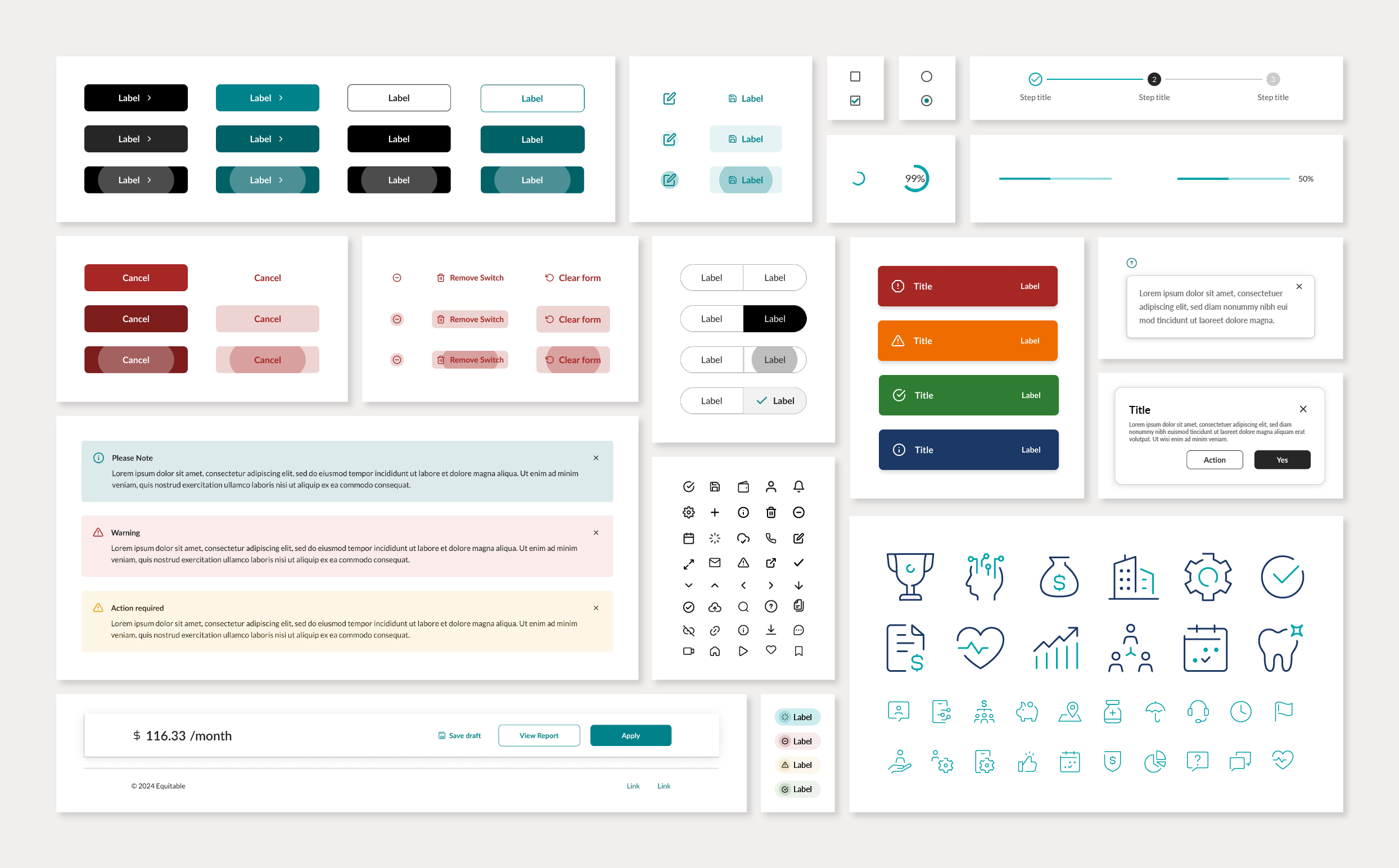
The guidelines also detailed standards for interactive elements and components like:
- Buttons: Defined button types for primary, secondary, tertiary, and destructive actions. Black was used for the main CTAs as it’s a safer approach for accessibility with optimal contrast and doesn’t cause confusion with other colours on the interface.
- Icons and emojis: Functional icons were used for essential actions as further communication to the user, while emojis added warmth to specific touchpoints, enhancing user engagement and giving the brand experience personality.
- Progress indicators: Custom teal-coloured steppers and progress bars informed users of their journey through multi-step processes and reinforced Equitable’s guidance value.
- Alert cards and snack bars: These components were created for critical updates and notifications, maintaining visual consistency with the alert colour scheme in non-intrusive formats.
- Navigation: Consistent navigation and footer designs were created for streamlined builds.
Continuing the rebrand journey
While the deployment of Equitable’s new brand is ongoing, our collaborative approach has significantly reduced friction in the process. This case study remains an active project as I continue to work closely with Equitable’s cross-disciplinary teams, regularly providing consulting, feedback, and updates to the UX/UI guidelines as we evolve the brand and address new challenges. Our partnership is grounded in ongoing support, enabling us to continuously refine and improve Equitable’s digital experience for users across all touchpoints.