Category
Role
Tools
Team
Client
Developing Monarch Quantum’s brand and website
Monarch is a new company in the quantum technology space, focused on delivering scalable, high-precision photonic hardware solutions for quantum computing, networking, and sensing. At the outset, they had no brand, marketing collateral, or digital presence, and their product had not yet been physically developed. To support market entry and position themselves uniquely, they needed to quickly establish credibility with investors, partners, and early customers in a highly technical and competitive industry. This required developing a professional, cohesive brand identity that stood out in a traditionally masculine-forward space, alongside a full suite of marketing collateral and a launch-ready MVP website. The goal was to create a polished brand foundation that clearly communicated Monarch’s mission, could evolve alongside product and business development, and ultimately support fundraising and talent attraction efforts.
Developing the brand
Monarch wanted a look that communicated quantum at scale, conveyed integrity and trust, and felt stable, reliable, and precise. They also wanted to stand out from competitors with a modern, professional, and slightly softer, more feminine aesthetic that also expressed innovation and leadership. In their words, a brand that felt like the “Apple of the quantum industry” and an intelligent, confident, Hermione Granger-like energy. This direction was our decision criterion as we developed their visual identity.
Research and competitive analysis
Before diving into the execution of their new brand, we conducted an extensive competitive and customer analysis. Reviewing common colour palettes, graphic elements, imagery styles, and typography to determine where we could fit into the industry and challenge the norms of an often masculine forward landscape. We also looked for inspiration on how to bring their values, mission, and overall aesthetic goals to life through different concept directions, and we reviewed other companies in different industries with Monarch in their name to ensure our ideas were original.
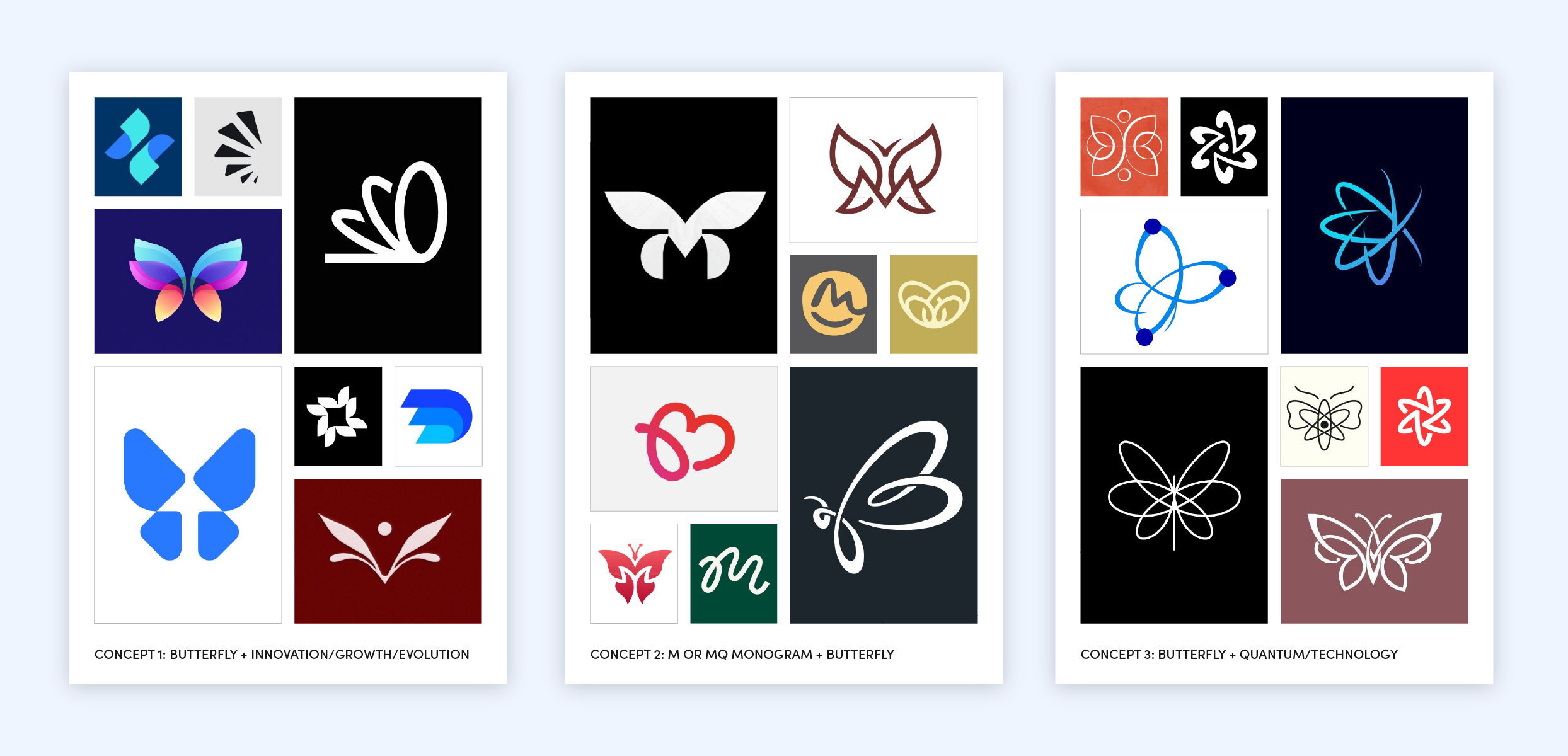
Logo exploration and concept development
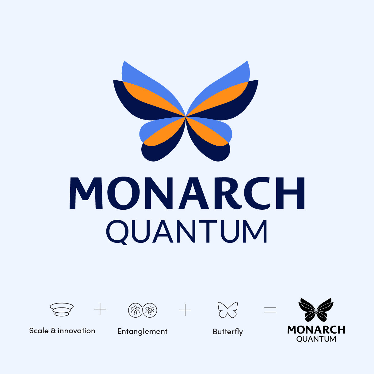
Following research and inspiration, we developed three initial logo concepts centred on Monarch’s core themes of innovation, precision, and quantum at scale. These concepts served as a gut check to ensure our interpretation of their goals was accurately reflected before expanding into full visual identity systems. Each direction balanced the science and the symbolism of the themes differently. Some leaned into atomic structures and entanglement to reflect Monarch’s technical foundation, while others used the butterfly as a metaphor for evolution and movement. We explored a range of executions, including shape and line-based forms, abstract interpretations of the “M,” and orbit-inspired elements, to explore how precision and approachability could coexist. This process surfaced a range of viable directions and allowed us to narrow our focus to two concepts that most strongly resonated with Monarch, which we then refined further before selecting a final direction.
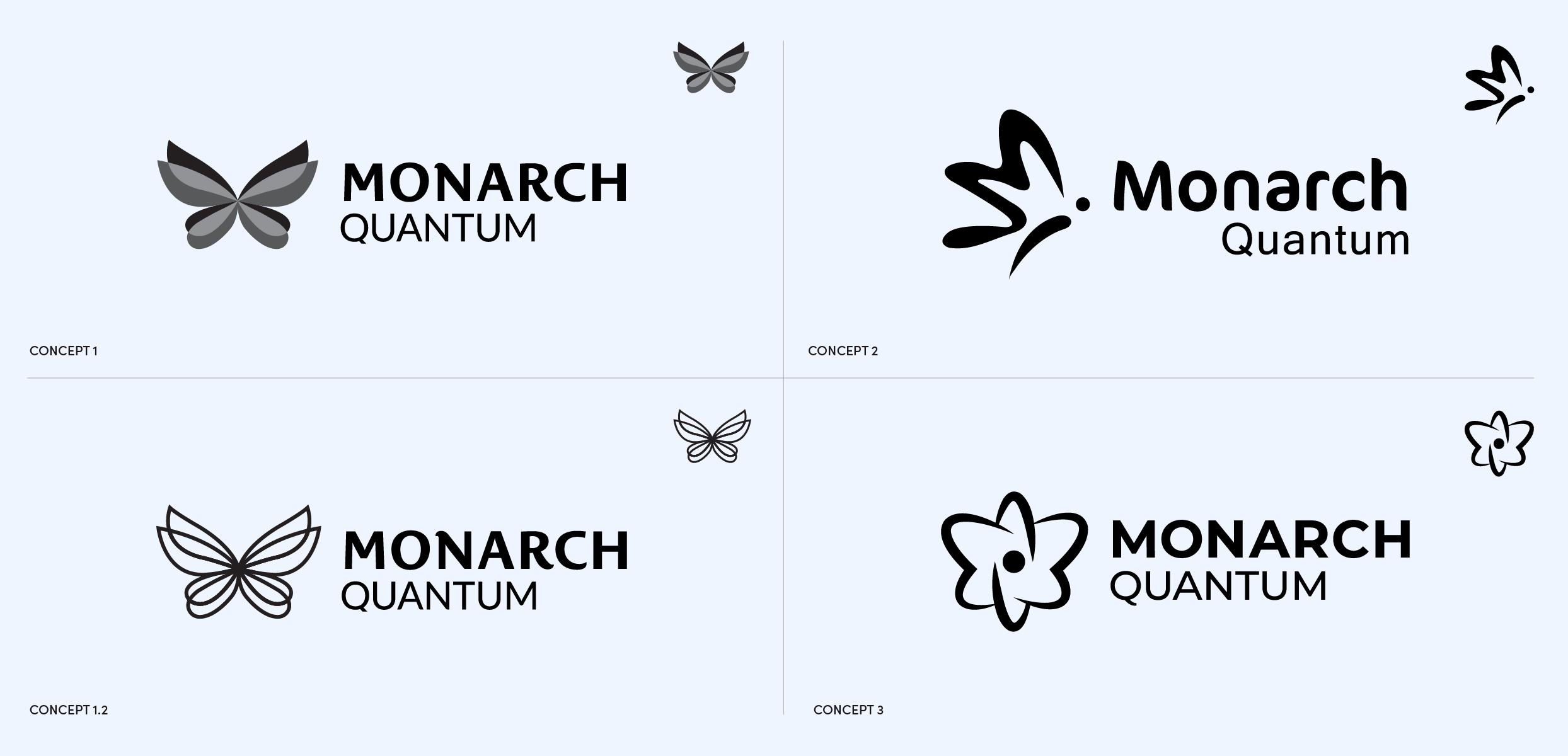
The final logo
The chosen concept focuses on communicating scale and innovation through the overlapping of the butterfly’s wings. The intertwining sections resemble the structure of an atom and the idea of quantum entanglement. The combination of sharp and soft edges reflects Monarch Quantum’s precision while maintaining an approachable and more feminine aesthetic. This balance is maintained by using two sans-serif typefaces that share similar characteristics with the icon, again blending sharp and soft shapes for cohesion. Lastly, the typefaces are set in all uppercase letters to convey confidence, stability, and reliability.
The visual identity
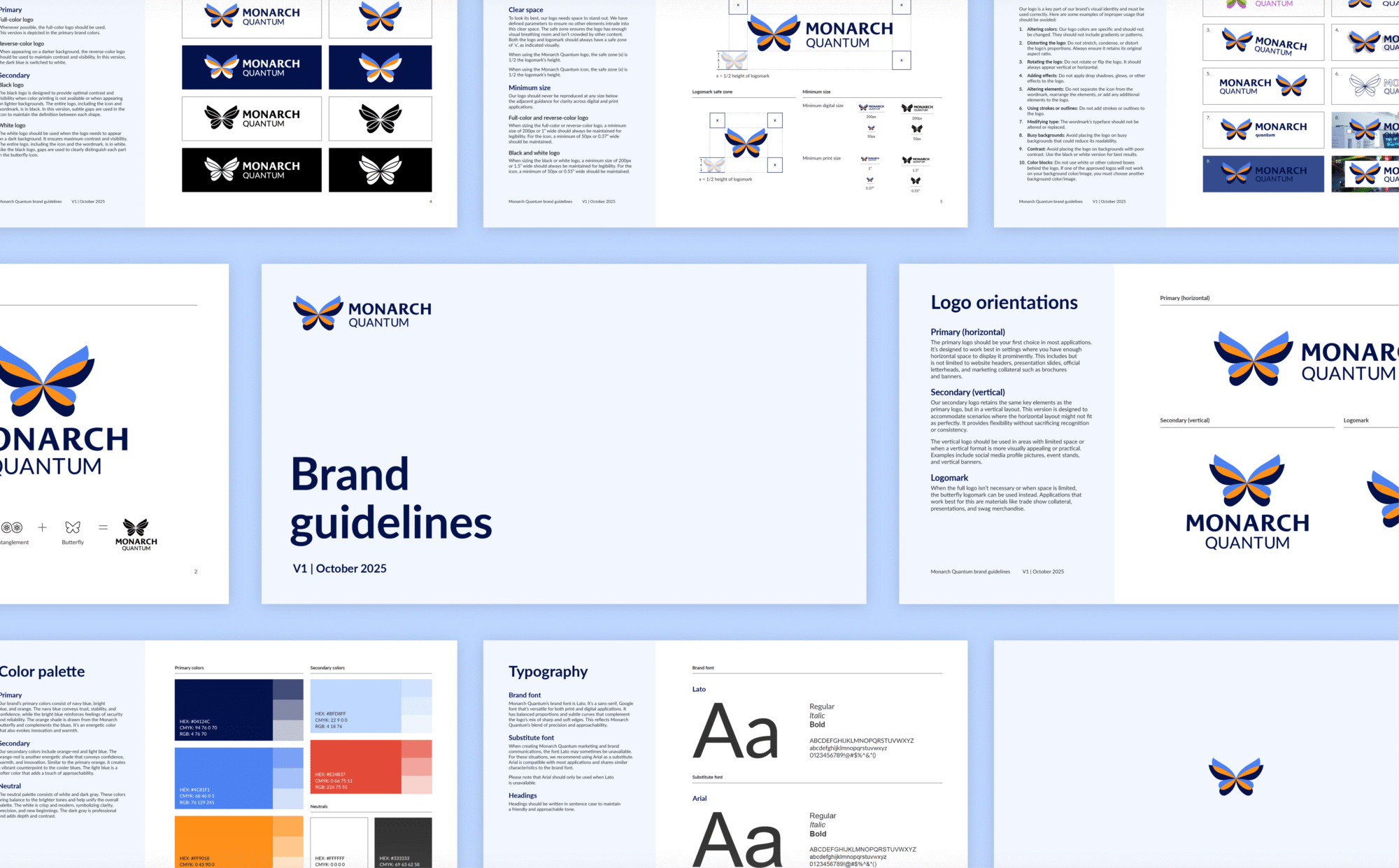
We developed a comprehensive visual identity for Monarch that extends beyond the logo to clearly reflect their vision and direction. This was captured in a set of brand guidelines covering the logo, colour palette, typography, and supporting design elements, creating a cohesive system that presents Monarch as professional and credible, while establishing a strong foundation for all future brand and marketing efforts.
Colour palette and typography
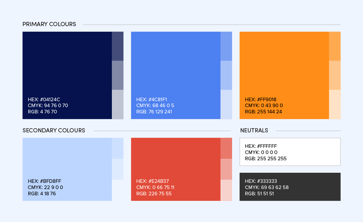
A combination of dark and light blues was chosen to give the brand depth and dimension while reflecting Monarch Quantum’s mission and values. The navy conveys trust, stability, and confidence, while the brighter blue reinforces feelings of security and reliability. A softer blue adds an approachable touch, balancing the brand’s more technical aspects. In contrast, two complementary shades of orange, inspired by the Monarch butterfly, serve as energetic accent colours that evoke confidence, innovation, and warmth, creating a vibrant counterpoint to the cooler blues. A crisp, modern white unifies the palette and symbolizes clarity, precision, and new beginnings.
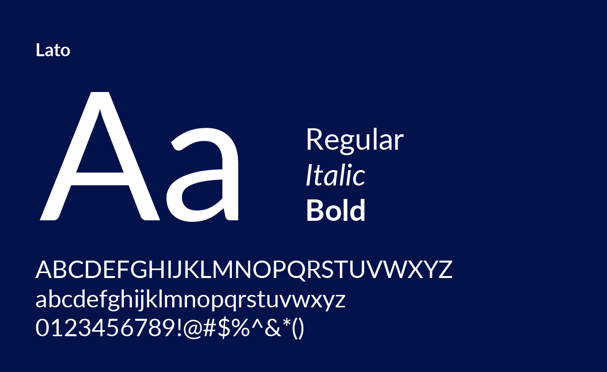
Lato was selected as the primary typeface for its geometric forms, consistent strokes, and versatility across both digital and print applications. Its balanced proportions and subtle curves complement the logo’s mix of sharp and soft edges, reflecting Monarch Quantum’s blend of precision and approachability. With nine available weights, it provides the flexibility needed for both headings and body text, ensuring a cohesive and scalable brand system across all touchpoints.
Imagery and visual elements
Since Monarch Quantum didn’t have any shots of their product (since it was still being developed) or team photography, we had to develop alternatives, such as patterned backgrounds, icons, and carefully selected stock photography to round out their visual identity. Therefore, we continued using overlapping elements that mimic the logo to further represent the concept of entanglement, scale, and growth. With this approach, we were able to fill the interim gaps left by the lack of visual assets while still delivering a credible, trustworthy brand across all touchpoints and digital channels.

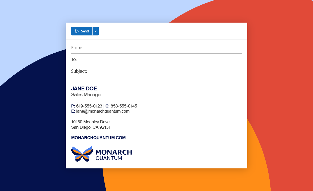
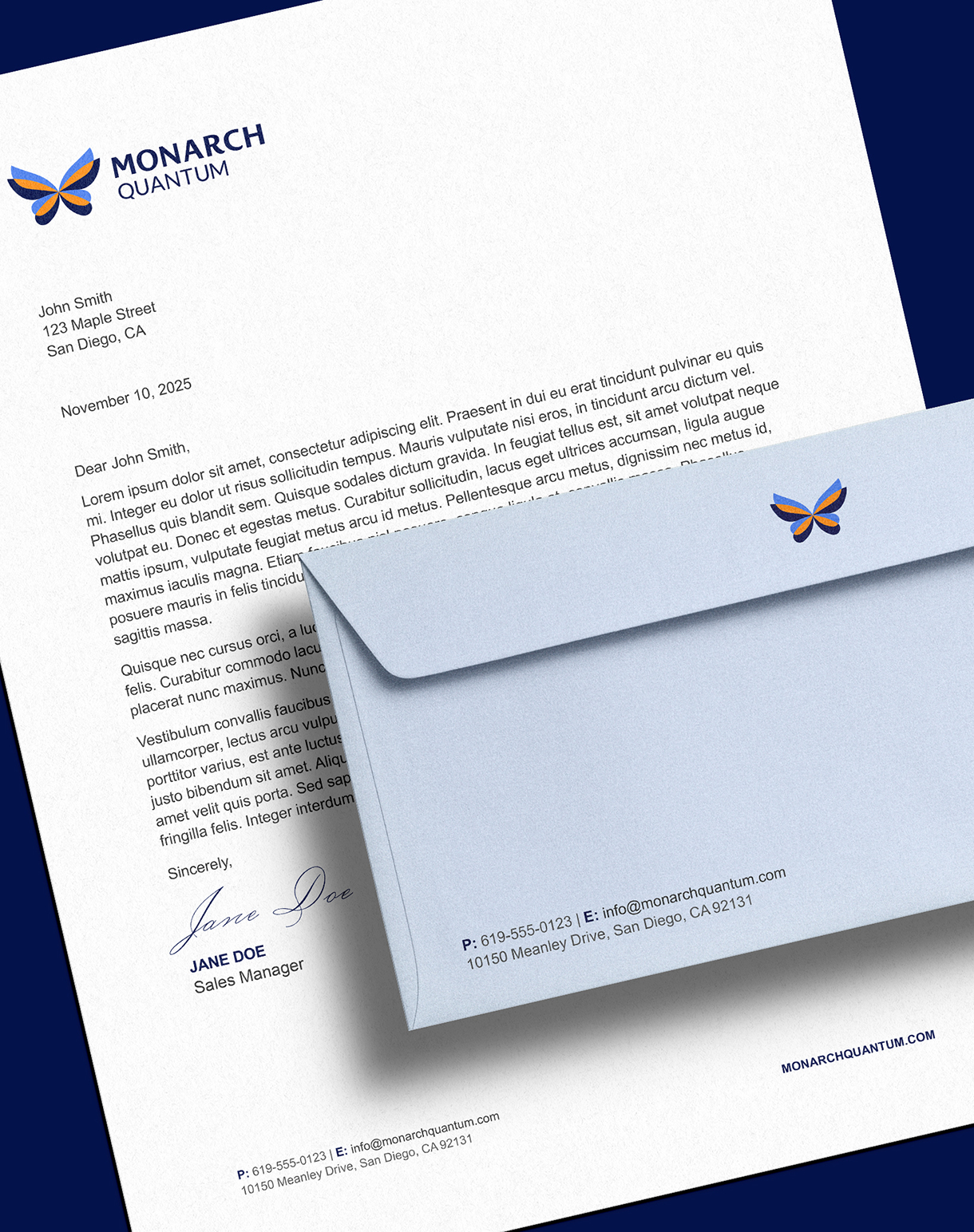
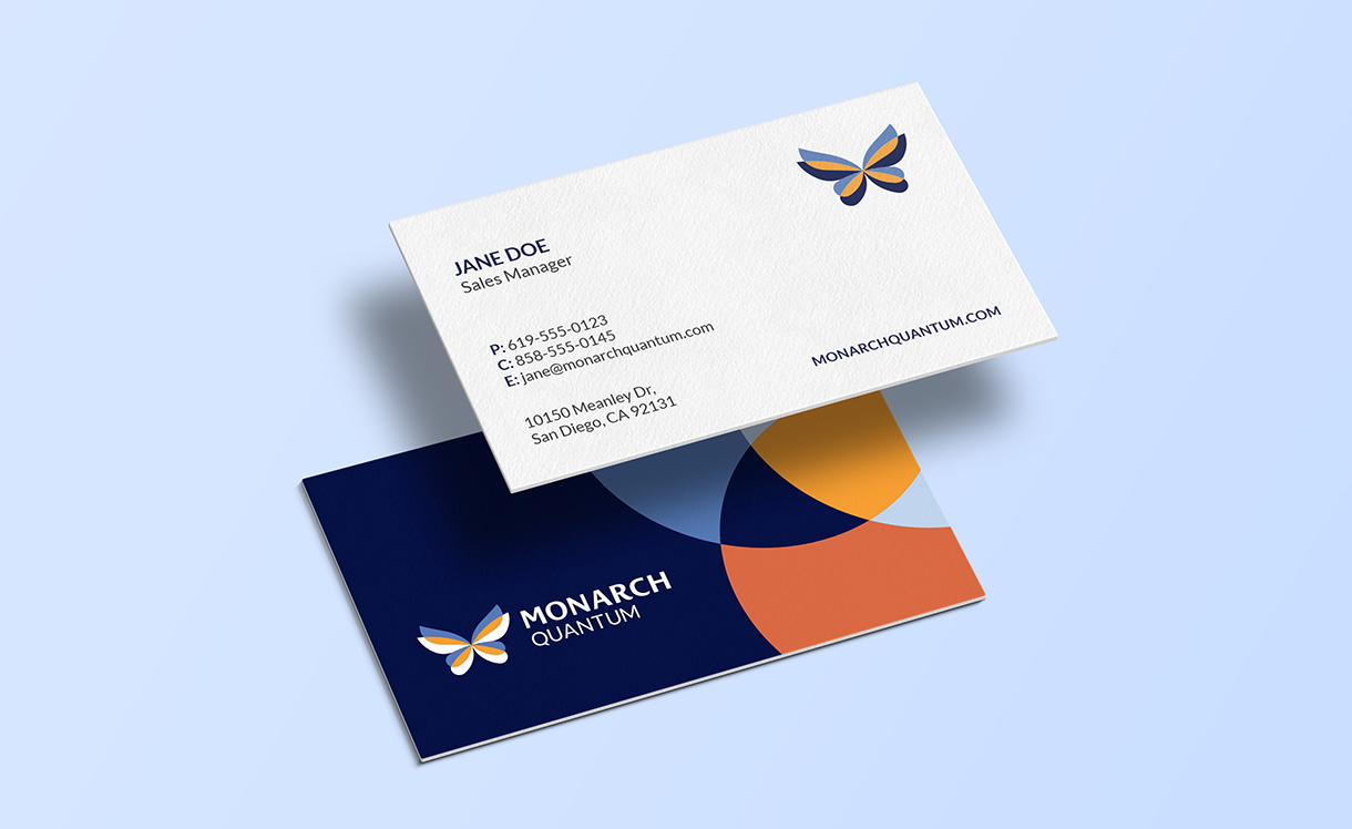
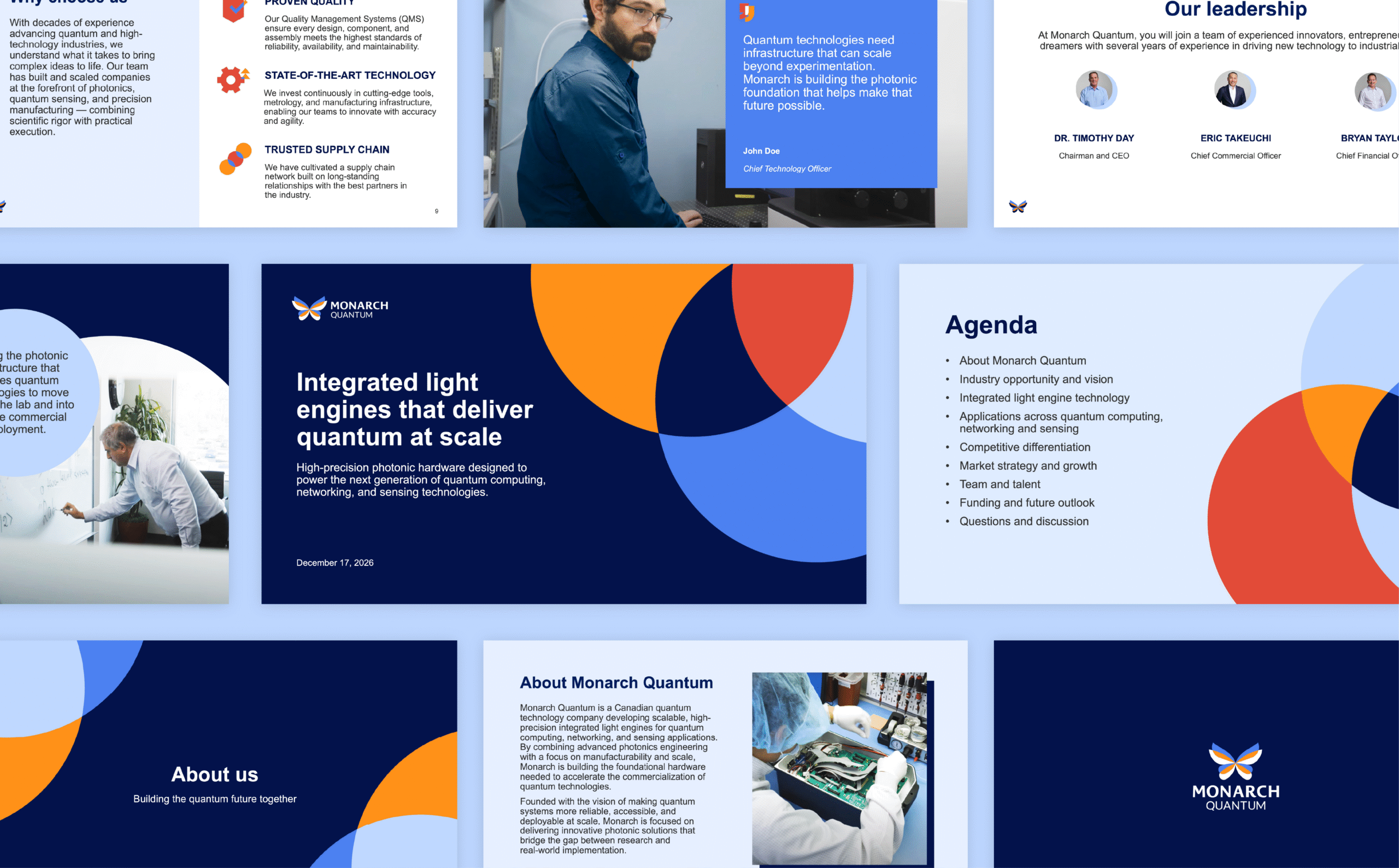
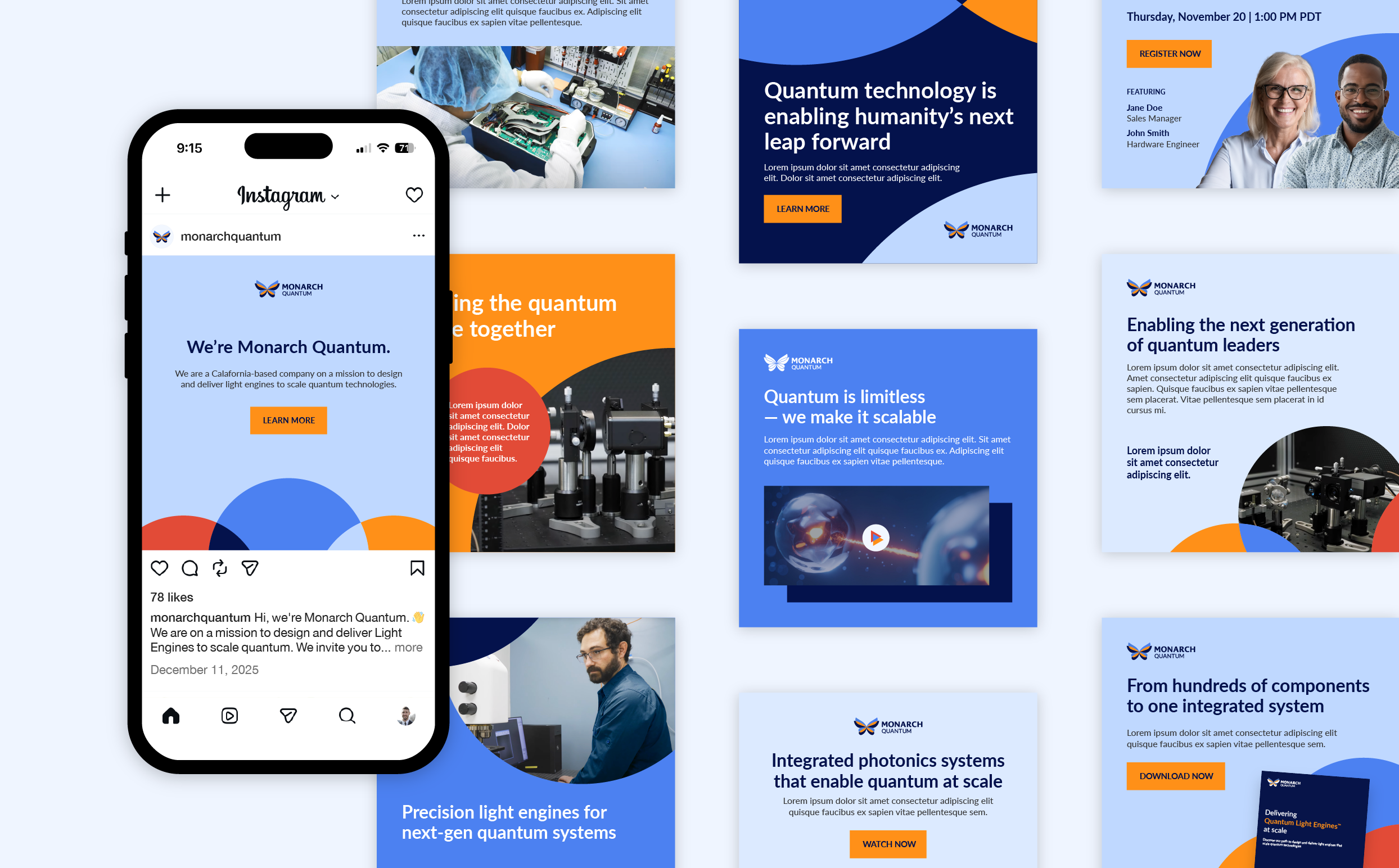
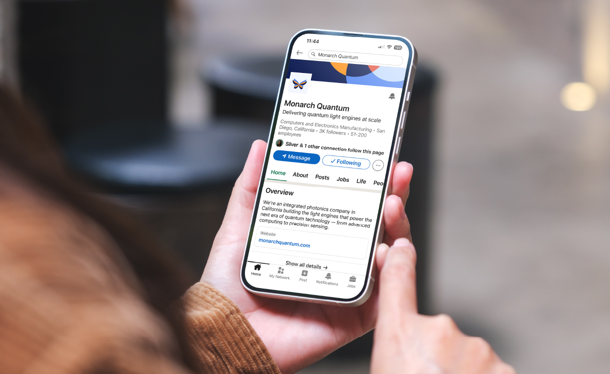
Ready to use marketing assets
With the brand identity established, we translated it into a full suite of foundational marketing collateral. Business cards, email signatures, letterhead, presentation templates, social media templates, and profile banners were created. Equipping Monarch with a launch-ready toolkit that enabled them to communicate consistently and professionally from day one, establish trust, and confidently engage partners, prospective candidates, and early audiences.
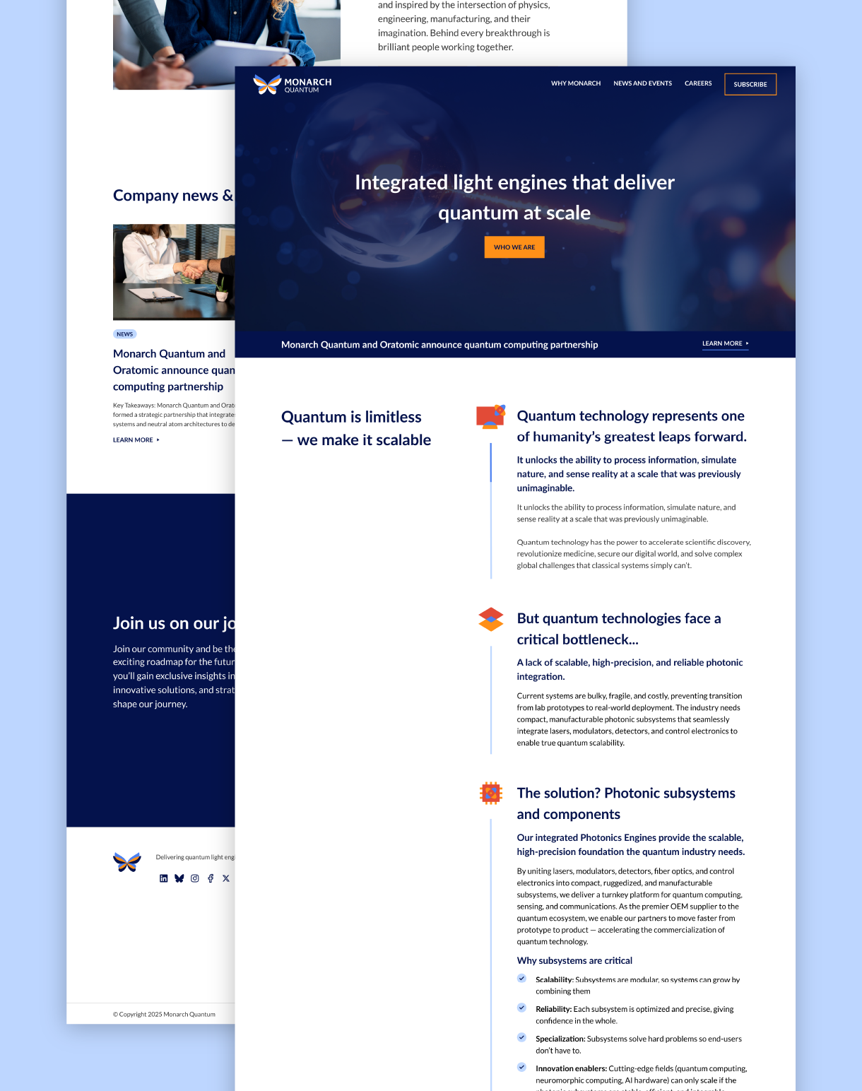
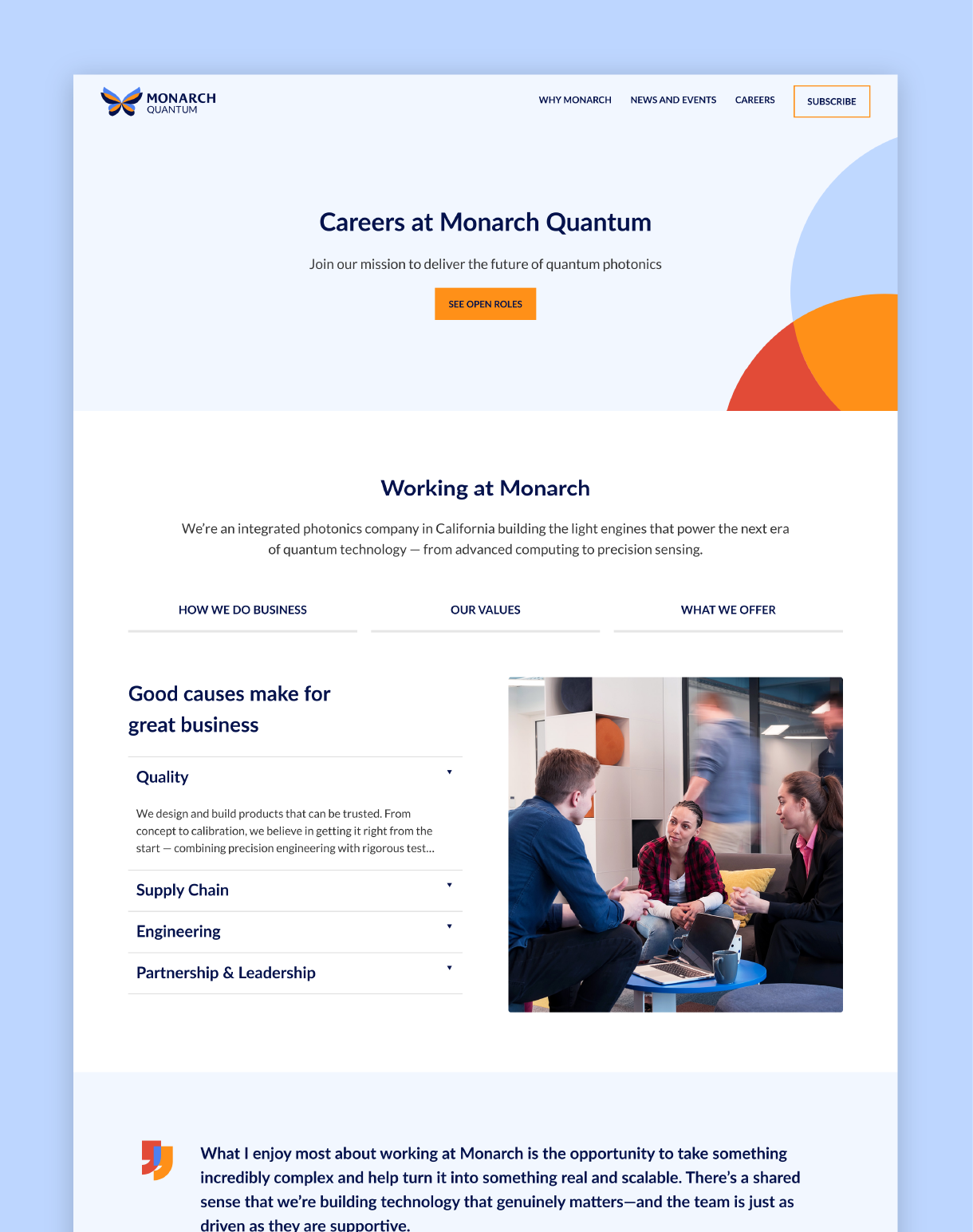
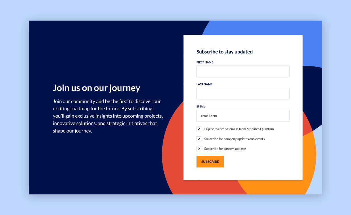
A website built for growth
To make Monarch Quantum tangible, we launched a two-page MVP website to support early market engagement and funding initiatives. The site was structured around their mission and story, with a strong focus on talent attraction to support rapid team growth. Layouts and messaging were carefully crafted to clearly communicate complex quantum concepts, reinforce credibility, encourage visitors to subscribe and follow their journey, and deliver a polished, professional, and approachable experience. The design was created in Figma using a reusable component-based design system and then developed in WordPress Gutenberg, enabling the Monarch team to easily maintain and evolve the site over time. This also established a scalable foundation for the next phase of their website, which is currently in development.
The result
The result is a cohesive and credible brand that transformed Monarch Quantum from a name and concept into a tangible, differentiated company. As a new business with no prior branding, marketing collateral, or digital presence, Monarch needed to secure funding and quickly establish early credibility. Through a strategic, iterative design process, we built a scalable brand system that positioned them as a polished, trustworthy company, enabling them to engage investors, partners, and future talent.
With a professional logo and website, and a full suite of foundational brand assets in place, Monarch Quantum was officially announced in December 2025 and debuted at SPIE Photonics West 2026. In their first month following launch, they grew their team to over 50 people and attracted more than 3,300 website visitors, reflecting strong early traction and engagement.