Category
Role
Tools
Team
Growing Stryve Digital Marketing’s brand
Stryve is a digital marketing and design agency in the heart of Silicon Valley North—Waterloo, Canada. It specializes in B2B (business-to-business) companies in various industries like technology, healthcare, and agriculture. For over eight years, I have worked internally on their team, starting as a graphic designer and working my way up to creative director. Over those years, I have helped form, evolve, and direct the Stryve brand through all touchpoints, allowing it to achieve its local recognition today.
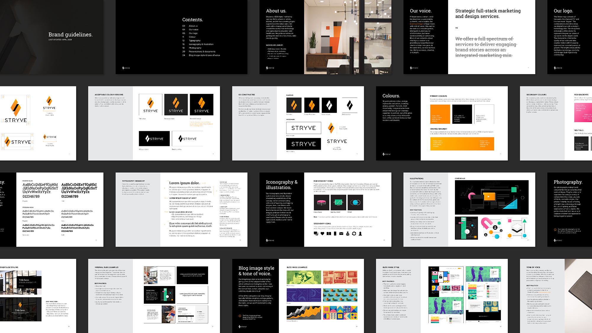
Stryve’s brand is modern, future-forward, and clever, with a digital-first mindset, and the key to their brand’s success was establishing and growing guidelines that outlined these core values and fundamentals so all team members can apply them to every decision, no matter how small the detail.
Less is more
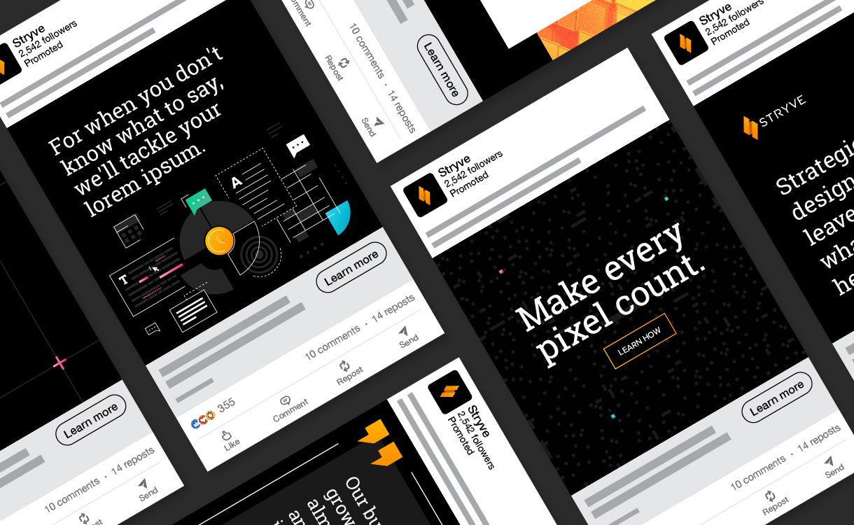
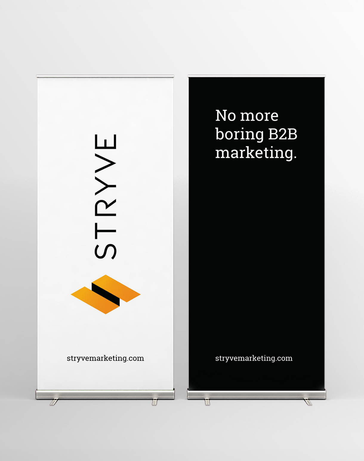
Using minimalist, clean, and type-forward layouts lets Stryve’s witty and clever content shine. At the same time, the primary font, Roboto Slab, has become an extension of the company’s logo and a distinguishable brand element because it shares similar characteristics with coding and doubles down on Styve’s digital-first mindset.
A colour palette with personality
Since 2015, Stryve’s primary colour palette has been orange, white, and black. The orange represents their innovation, creativity, energy, fun culture, and hunger for success or food! It’s used in small doses throughout their collateral to avoid looking like Halloween, while their neutral tones keep their brand feeling fresh, modern, and futuristic.
In recent years, I’ve expanded their colour palette to include dark pink, light green, and blue, inspired by the additive colour model for digital screens that I named the brand’s RGB colours. These colours also have a slight gradient that emulates the one used in the company’s logo, giving them a high-tech, app-like feel that has refreshed the brand’s aesthetics and opened up a world of new possibilities for design and layouts while staying true to its core values.
Custom illustrations and icons
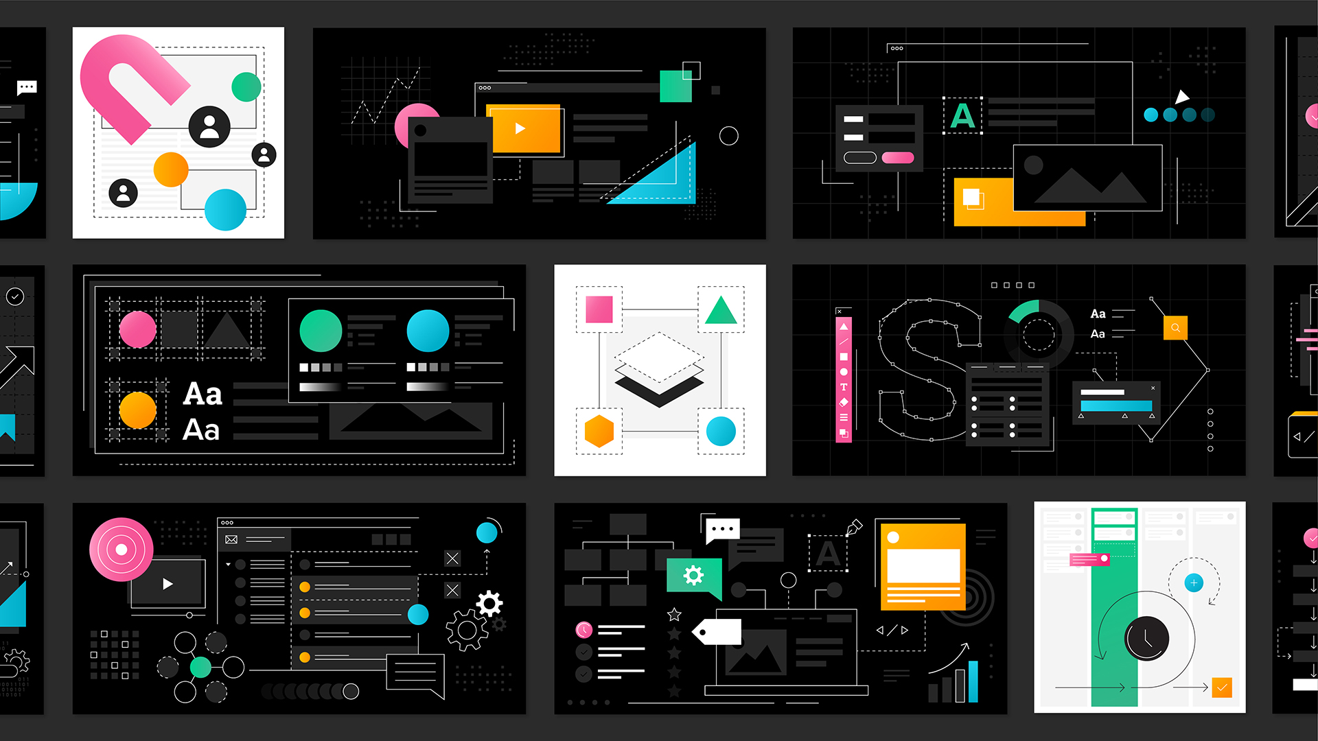
Photography for Stryve that highlighted their unique culture or services was challenging to capture and source. Therefore, I created a custom illustration and icon style that helps them stand out against the competition, move quickly with their marketing initiatives, and blend with their limited photography and office aesthetic.
The style is abstract, simplified, and deconstructed representations of the elements that go into a service or, in general, avoid being too literal when depicting a concept. They consist of overlapping shapes, lines, and details that create depth and layers. They use colour strategically where the RGB colours are in order across a composition, with Stryve’s orange as an accent.

A unique online presence
Stryve’s previous website was six years old and needed to be more reflective of how much its brand, business, and services had grown. They needed a more robust website that highlighted their capabilities and services that would increase lead generation. The solution was to build a mega menu and pages for each service offering and better explain Stryve’s processes and differentiators throughout the user’s experience. Each service page also included a custom form to allow Stryve’s marketing team to understand and test the information sales needed to quote accurately. It also allowed them to use these pages directly in campaigns instead of creating separate landing pages.
Aside from the website’s structure and function, all design choices have a purpose or reason that builds off nuances of the brand’s core values, like its digital-first and future-forward mindset. Details like square corners and custom mosaic glitch effects imitating pixels, rotating letters on the homepage to represent coding, large doses of black inspired by space, or sleek animations and background transitions.
Bingeable content experience
In addition to Stryve’s main website, they have a blog they post content to weekly, where they share their knowledge and insights. They’ve grown an impressive library since 2008, and their previous three-column chronological grid with stock photography wasn’t cutting it anymore and encouraging users to linger.
The solution was creating a content hub and building a more dynamic experience that behaved like an app. The first step was to rethink the function and structure of the hub and group the homepage into unique sections, including what’s recent, the most popular, and trending. On top of categorizing content into three overarching buckets, such as design, marketing, and culture, which helped users find what they’re looking for faster, extended the shelf life of their content, and increased page views by 172%. At the same time, breaking away from the tired, rigid blog format created a more engaging interface through its design features like horizontally navigable and overlapping sections, micro-animations, progress bars and custom-made imagery that bled off the screen, which resulted in the time on site raising by 377%.
Off-screen presence
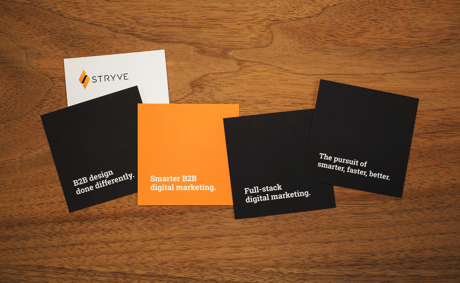
While Styve’s service offerings and marketing depend on digital, it is still vital that its brand extends through all avenues, including traditional mediums and in-person interactions, like stationery and print collateral, swag, or office aesthetics.
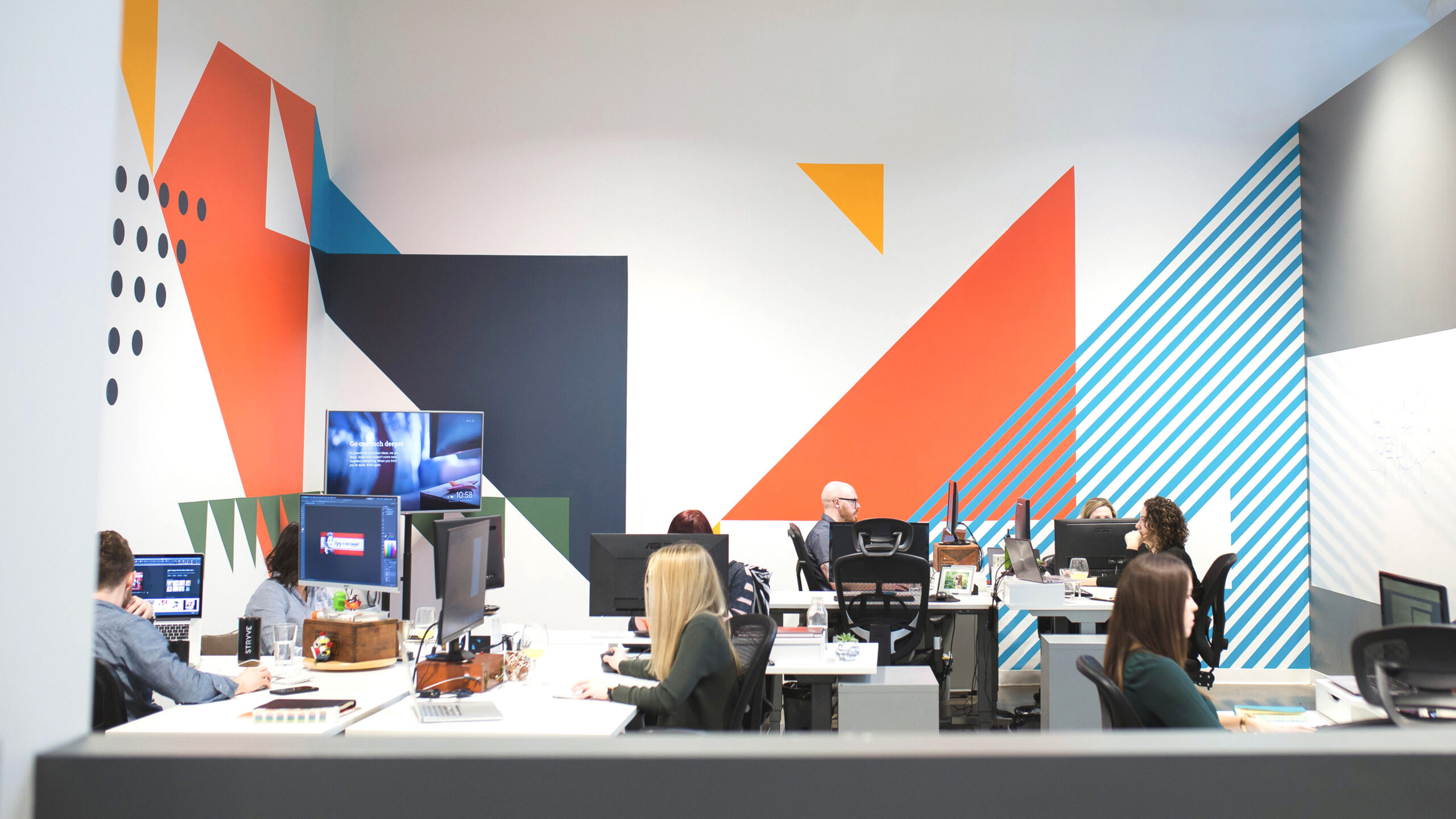
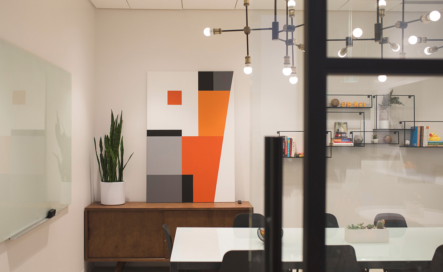
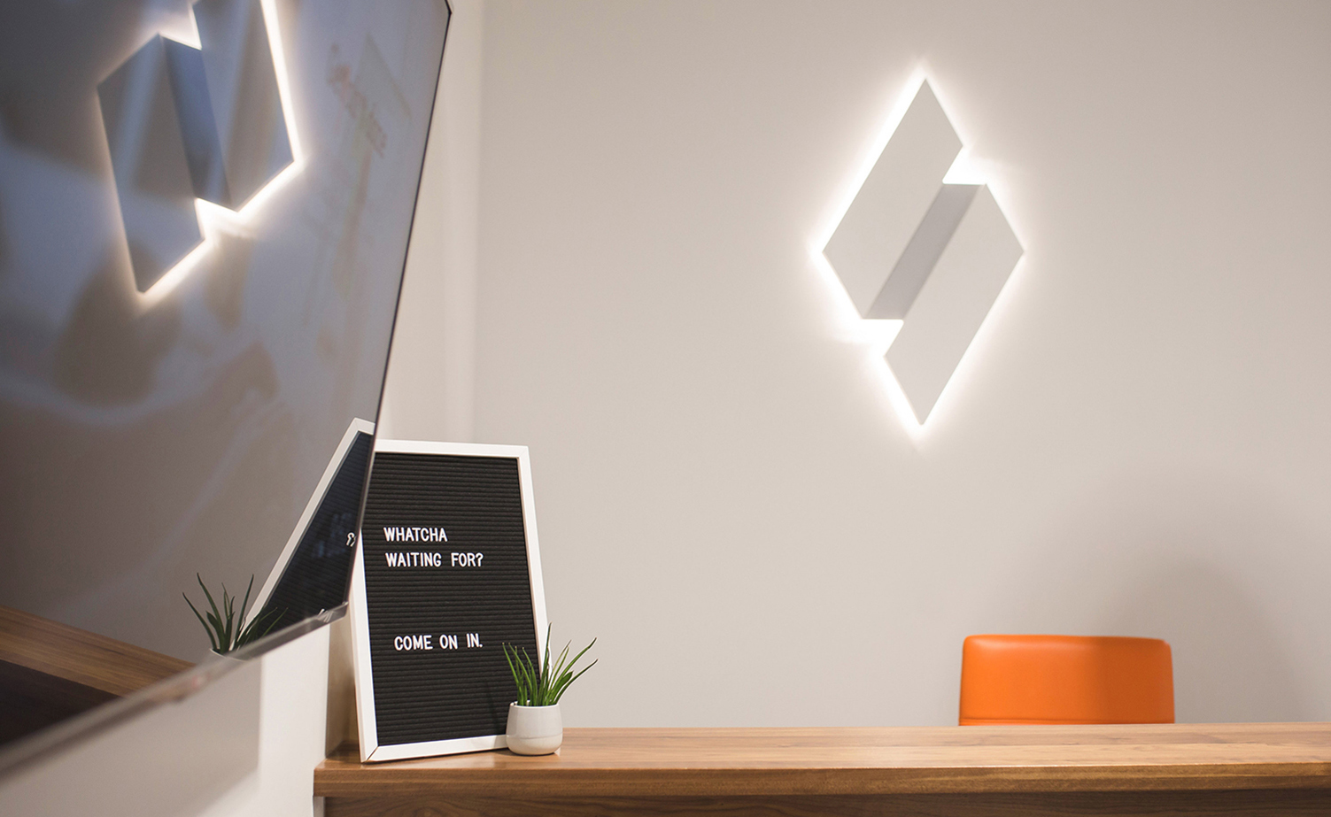
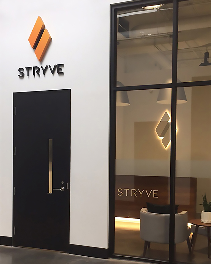
Much like their online presence, their office avoids the overuse of the logo or primary colours and represents the brand in subtle and clever ways. For instance, the front door highlights the full-colour logo for wayfinding purposes. In contrast, their reception area deconstructs the identity by placing the wordmark on a warm walnut reception desk with a bright orange accent chair, and the diamond is a tone-on-tone backlit piece of art. Further into the office, their working space includes a mural based on an abstract map of Kitchener-Waterloo and the landmarks that impacted Stryve’s history, along with custom-made art for their boardroom inspired by the midcentury era and pixels.
