Category
Role
Tools
Team
Client
Modernizing PCC Integrate’s brand
PCC Integrate specializes in smart-building technologies and offers tailor-made, integrated services spanning audio-visual technology, sound masking, and various IT infrastructure solutions. They aimed to refresh their brand into something bold, memorable, and modern, aligning it more closely with their services and tech sector. While simultaneously retaining the awareness and trust that their current identity has for their customers.
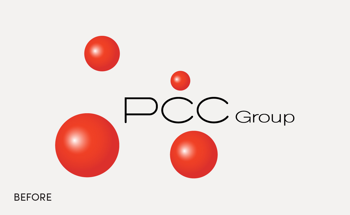
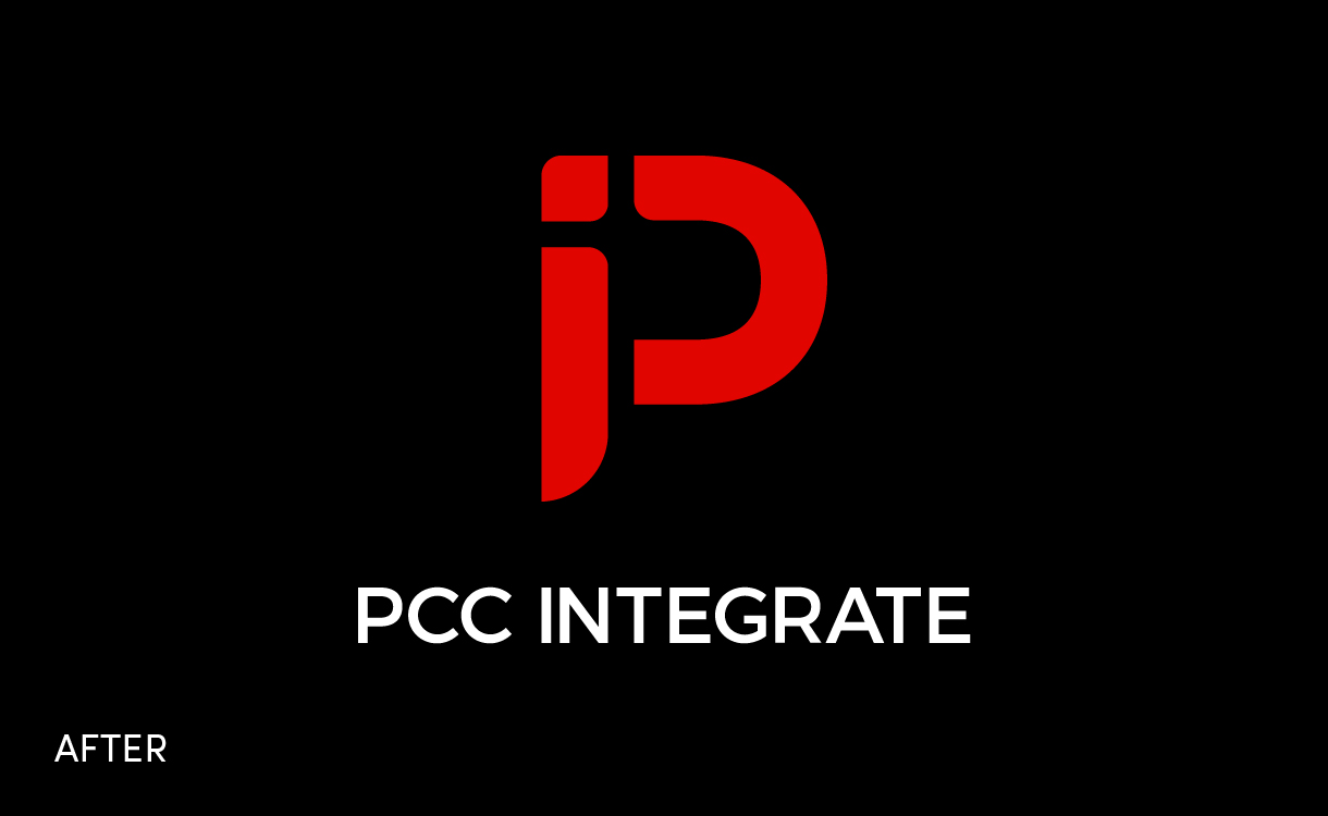
A new modern logo
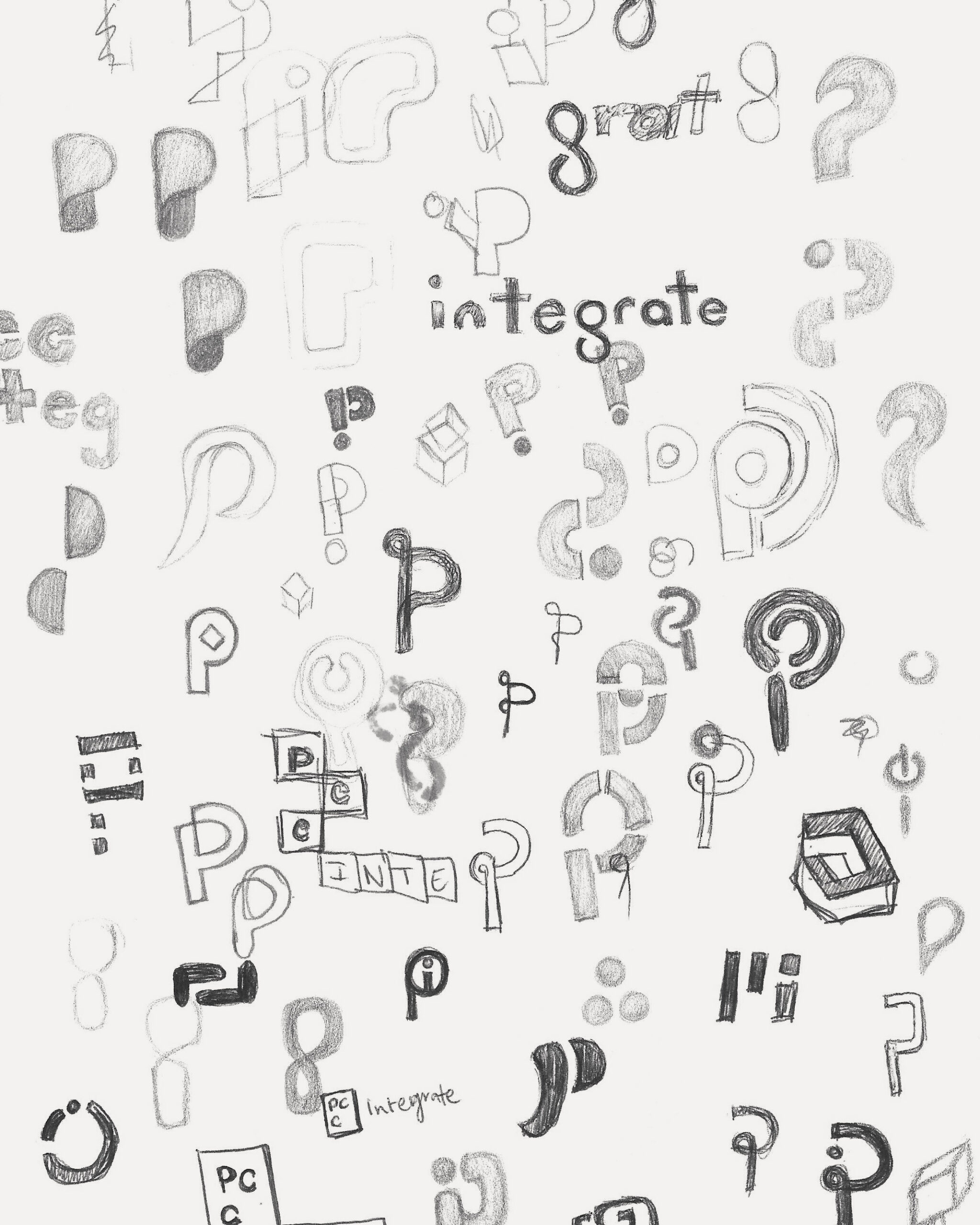
The process of designing PCC Integrate a new logo started by learning about the company, their services, mission, and role in the smart building movement, including a multiple-choice survey for their team outlining different types of logos and design elements to understand their aesthetic preferences and vision further.
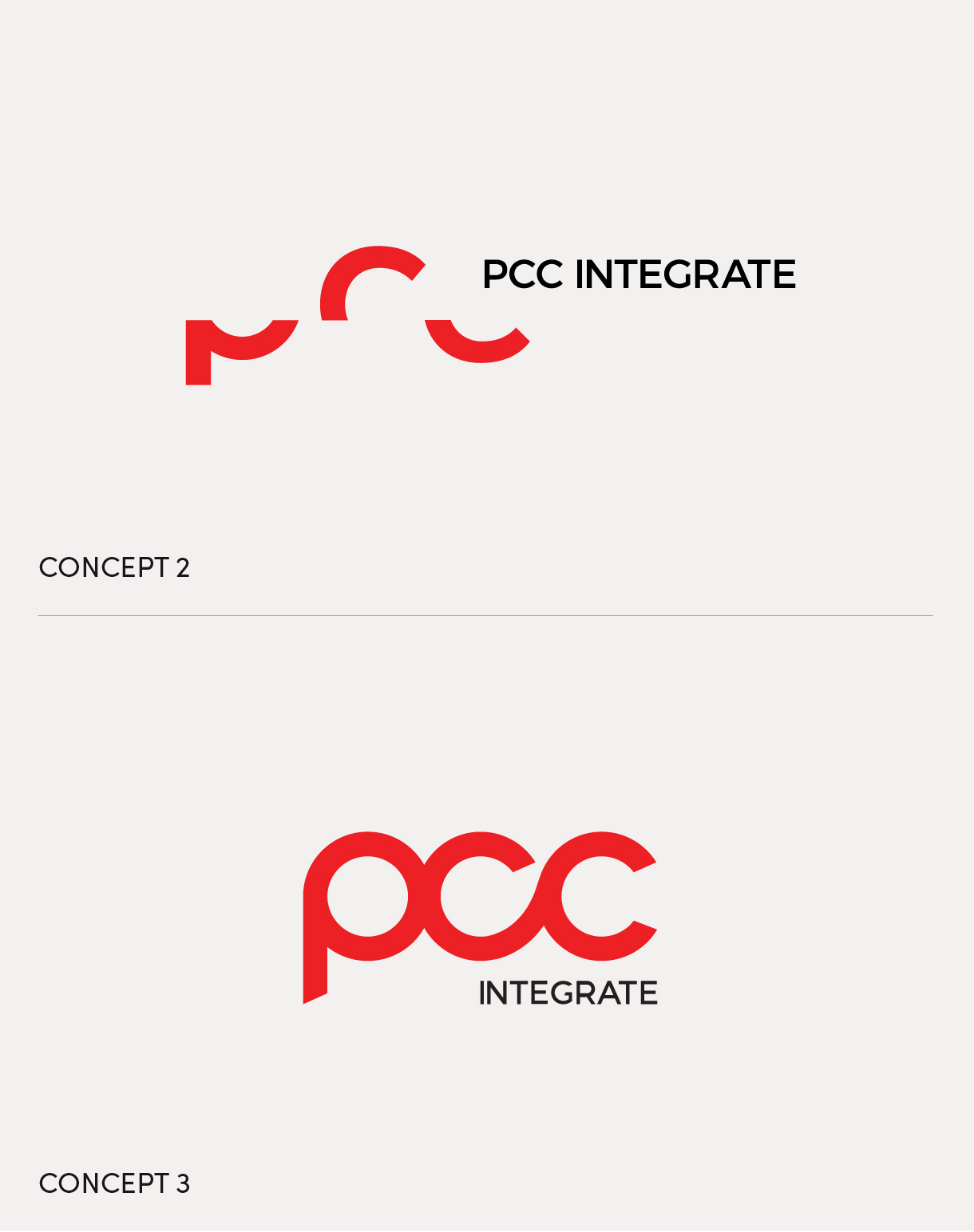
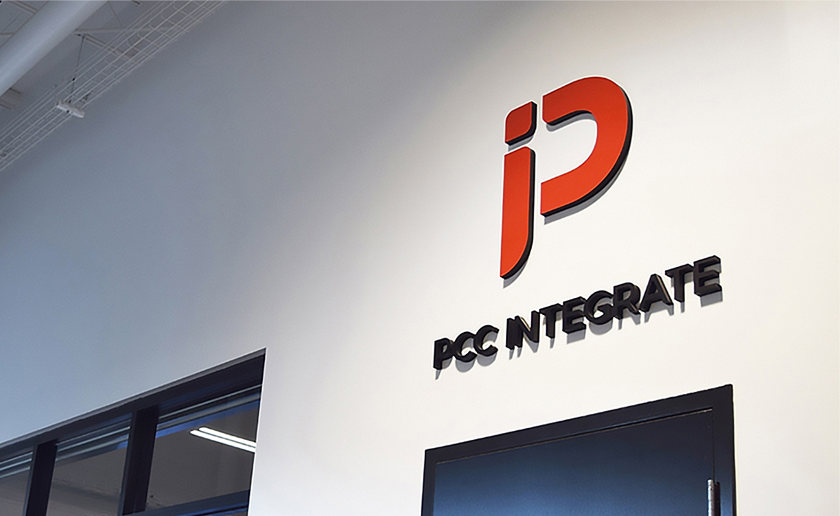
The results from these exercises reinforced the need for a logo that exudes a simple yet modern look, effectively communicating their modular and adaptable technology solutions. Subsequently, I presented three concepts designed to fulfill this objective and demonstrated how they could translate across various touchpoints and mediums. Ultimately, the chosen concept stood out for its bold, sharp, and clean design. The subtle use of negative space combined with hard and soft corners created a fluid and flexible logo while remaining bold and precise. The logo also plays on the “IP” associated with PCC Integrate.
More than just a new logo
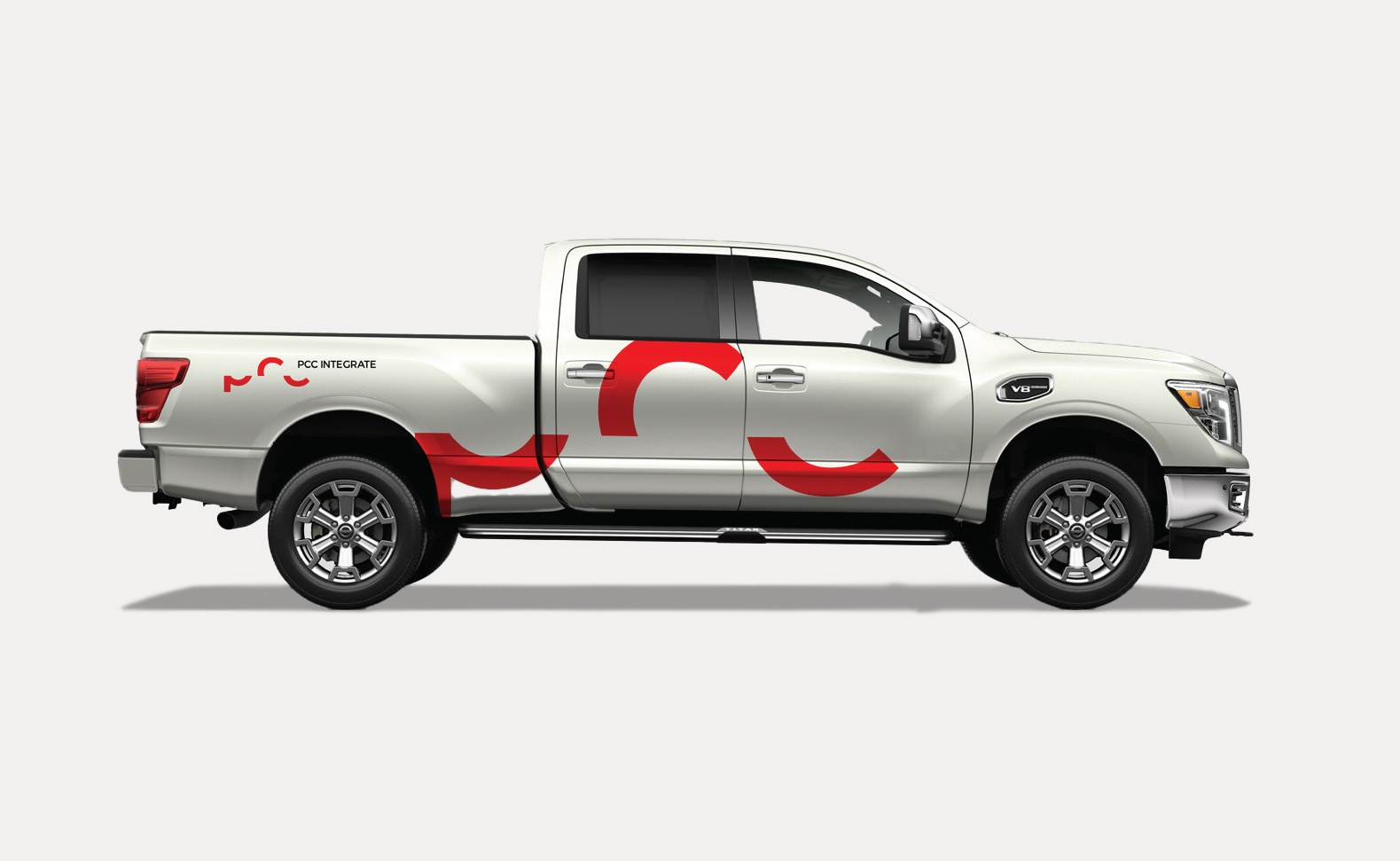
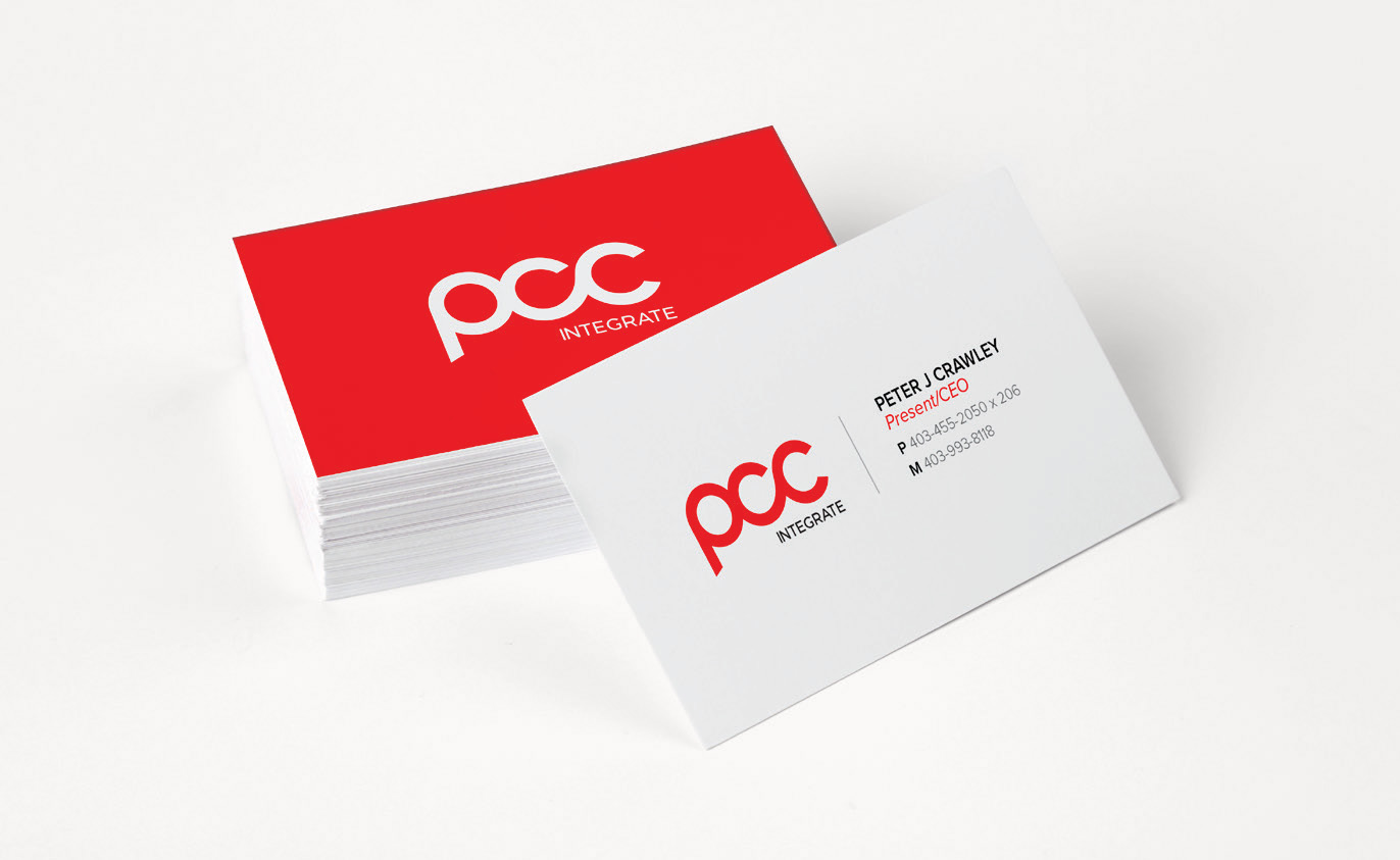
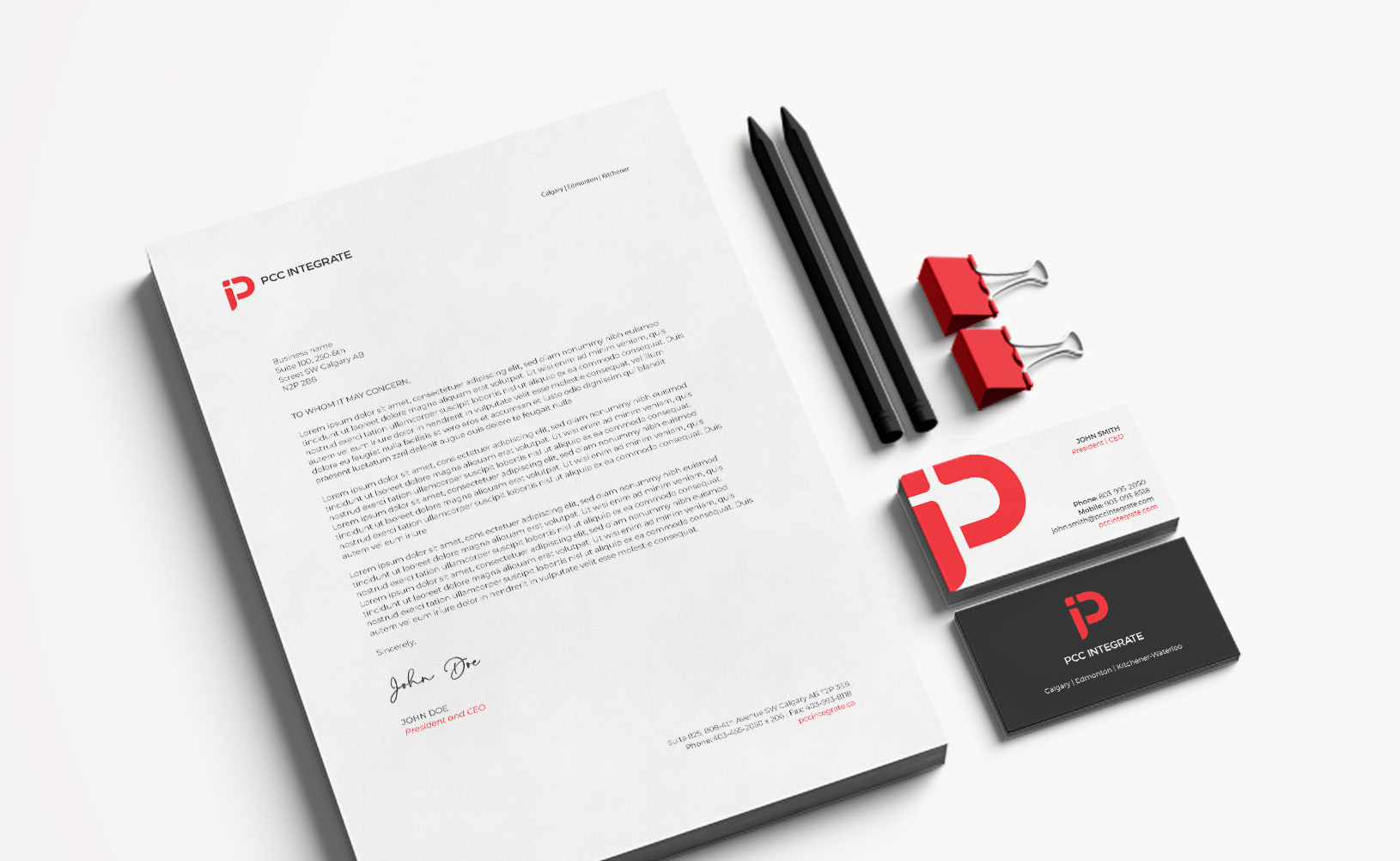
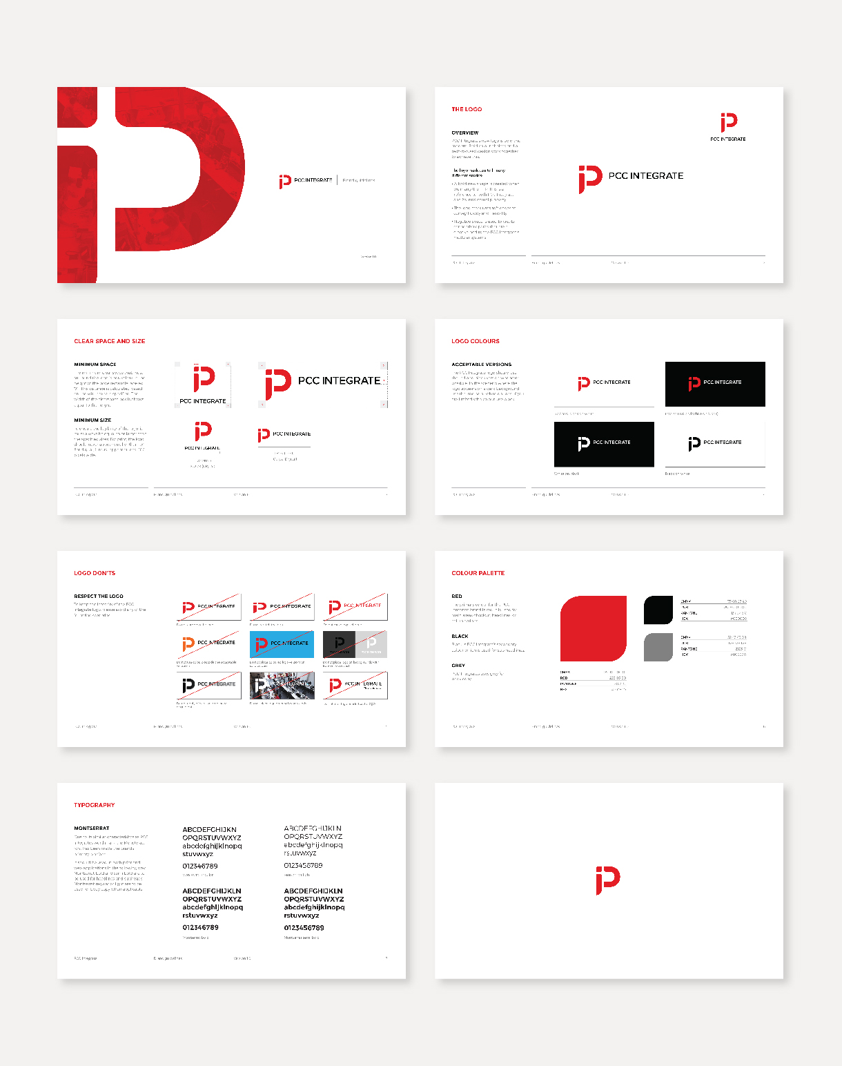
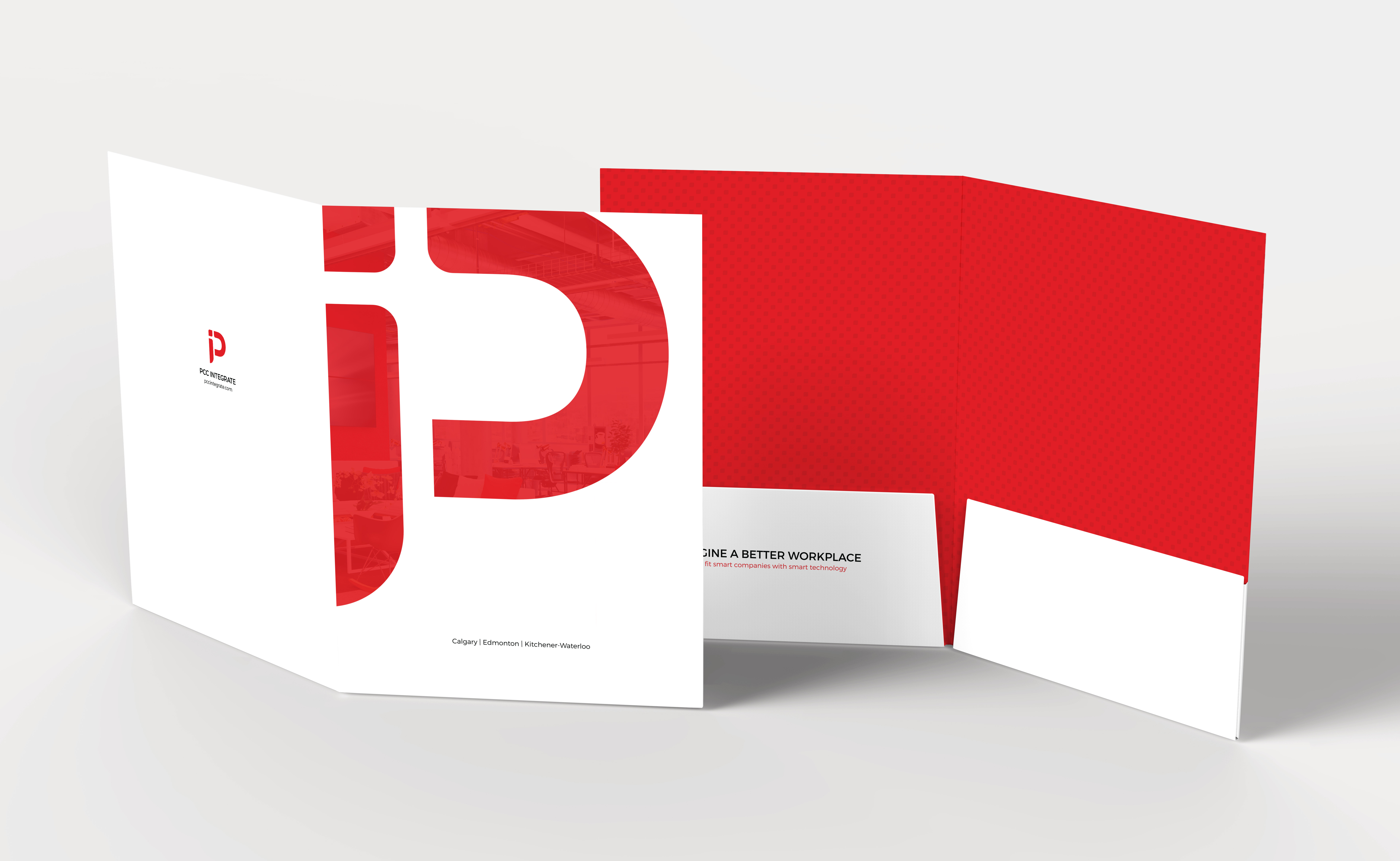
With the new logo finalized, I refined the chosen concept further by exploring how it could translate into a cohesive brand experience and developed brand guidelines. To preserve the recognition that PCC Integrate had already established with its previous branding, we kept the primary colour bold red and paired it with a neutral colour palette. Additionally, we introduced the modern sans-serif font, Montserrat, which gave the brand a sleek and contemporary feel. The interplay between sharp and rounded corners, drawing inspiration from the logo’s icon, serves as a design element across their touch points, symbolizing the company’s commitment to precision and adaptability.
A modern website
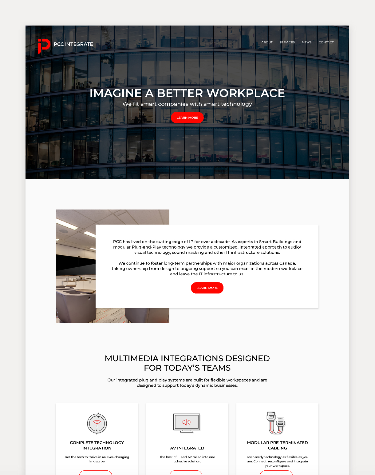
PCC’s website was the final asset to undergo a makeover, featuring a layout with an intentional overlapping structure that emphasized the brand’s modular service offering. At the same time, their primary red is strategically highlighting calls to action and custom line icons. I also used large doses of white and light grey to guide users seamlessly through the site by breaking up content into digestible chunks. This approach and incorporation of large photography played a pivotal role in emulating a sleek and modern online presence that is user-friendly.
The result was a successful brand evolution for PCC Integrate
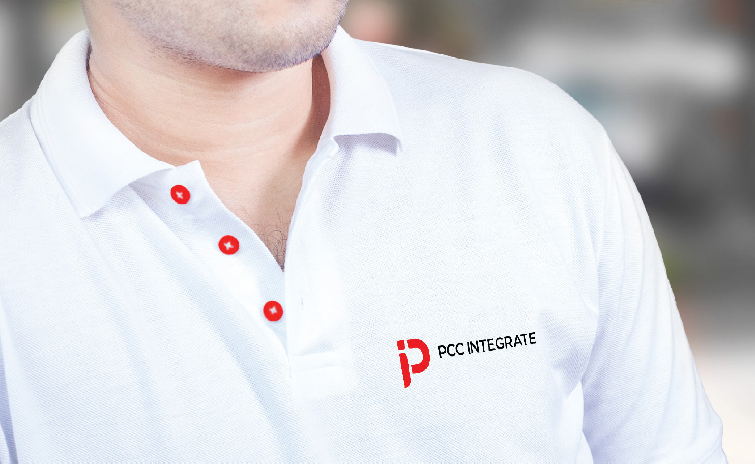
Through a meticulous design process, PCC Integrate now boasts a refreshed brand identity that speaks to their leadership in smart building solutions. The new logo, characterized by its bold, clean lines and subtle use of negative space, encapsulates PCC’s commitment to modular and adaptable technology. Complemented by a modern color palette centered around their signature bold red and refined typography with Montserrat, the brand guidelines ensure consistency across all touchpoints. The redesigned website further enhances their digital presence with a modular layout and strategic use of visuals, reflecting PCC Integrate’s innovative and user-centric approach.