Category
Role
Tools
Team
Client
Rebranding the eHealth Centre of Excellence to Amplify Care
Amplify Care, formerly known as the eHealth Centre of Excellence, is an organization committed to supporting clinicians and their teams with innovative, technology-driven solutions that meet clinical needs and improve patient experiences. By improving clinical workflows and patient outcomes, they equip clinicians with tools that alleviate administrative burdens and improve patient care.
They changed their name to further build on the legacy they had established and to emphasize the support they provide to clinicians in the digital health space. The name ‘Amplify Care’ was chosen to represent listening and responding to feedback, therefore amplifying the voices of clinicians and primary care providers. In addition to their new name, they also needed a brand identity and system that represented their refreshed mission and values.

Aligning on vision: laying the foundation for the new brand identity
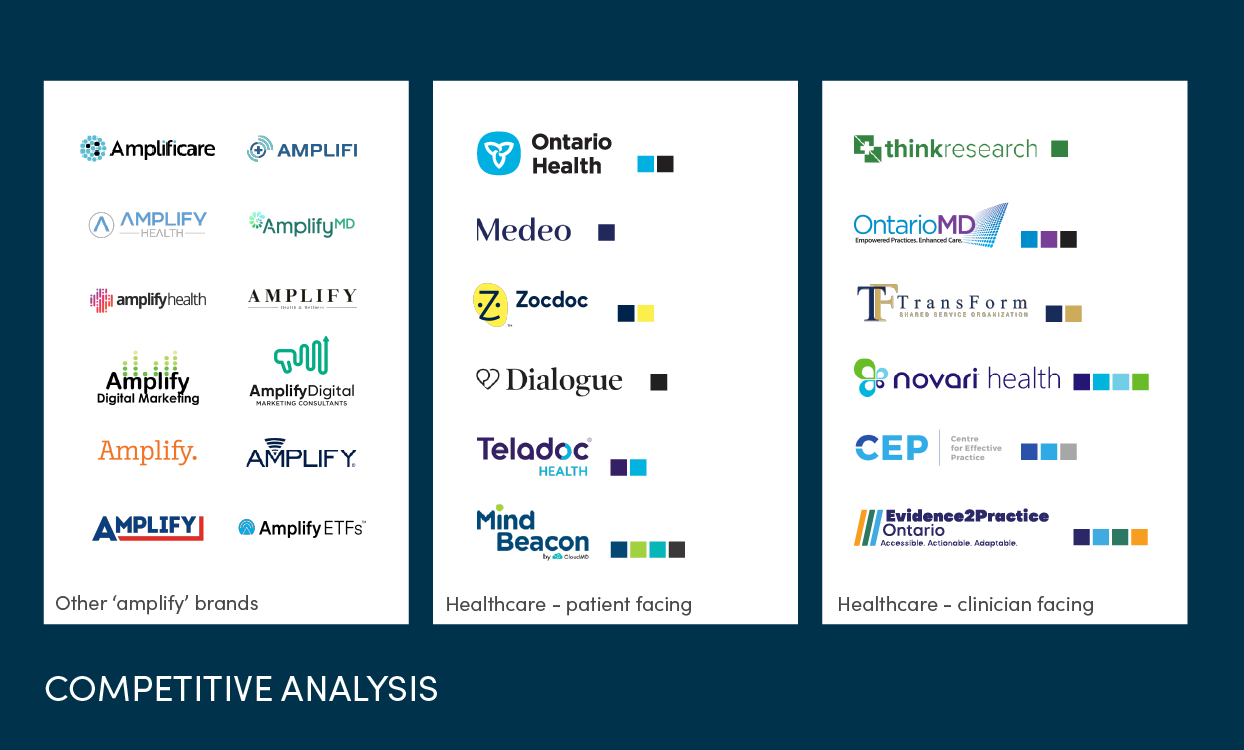
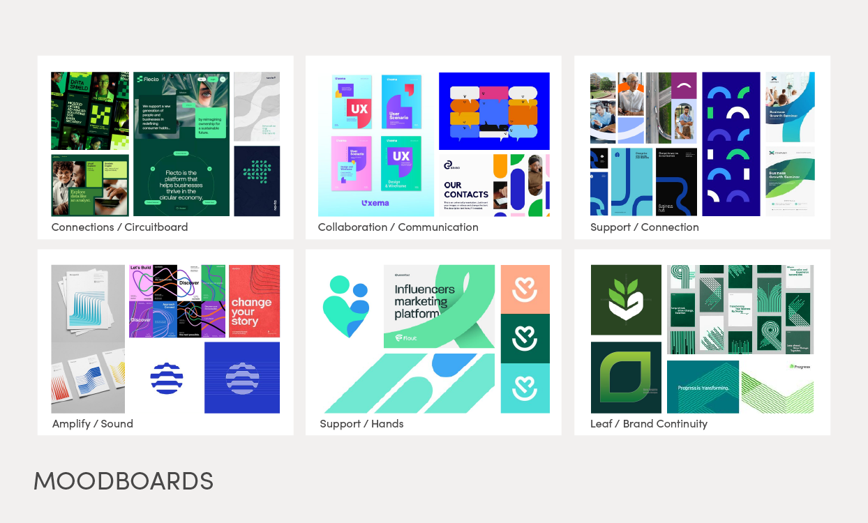
Amplify Care’s renaming was a significant change for them, and it was crucial that we developed a brand identity that accurately represented their evolution, mission, and values. And with that came some big decisions on what that could look like. We started by ensuring their leadership team was on the same page regarding their vision through a series of conversations, where we explored their design preferences, such as colour palettes, aesthetic elements, and brands that resonated with them (or didn’t). We examined their competition and identified ways to differentiate them. We also discussed whether elements from their old brand should be carried over, like their green and circuit board details. We then developed six mood boards that helped further narrow down the core themes, elements, and goals to focus on, which were:
- Digital-first health
- Support
- Approachability
- Partnership
- Connection (the connection point between the rest of the healthcare industry)
Creating a new brand identity for Amplify Care
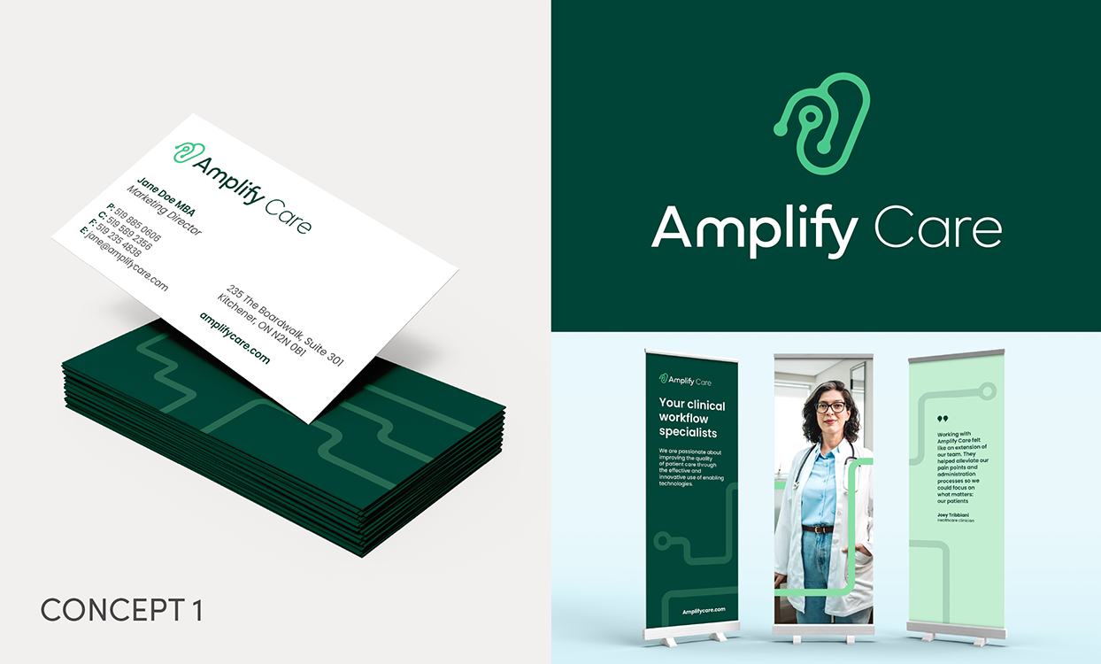
We created and presented three logo concepts and potential brand expressions to Amplify Care, each uniquely demonstrating their objectives. Rather than presenting just a logo, we wanted them to be able to fully visualize how their new identity could appear in the world through colour, typography, imagery, and other graphic elements, and how these components contributed to their overall brand.
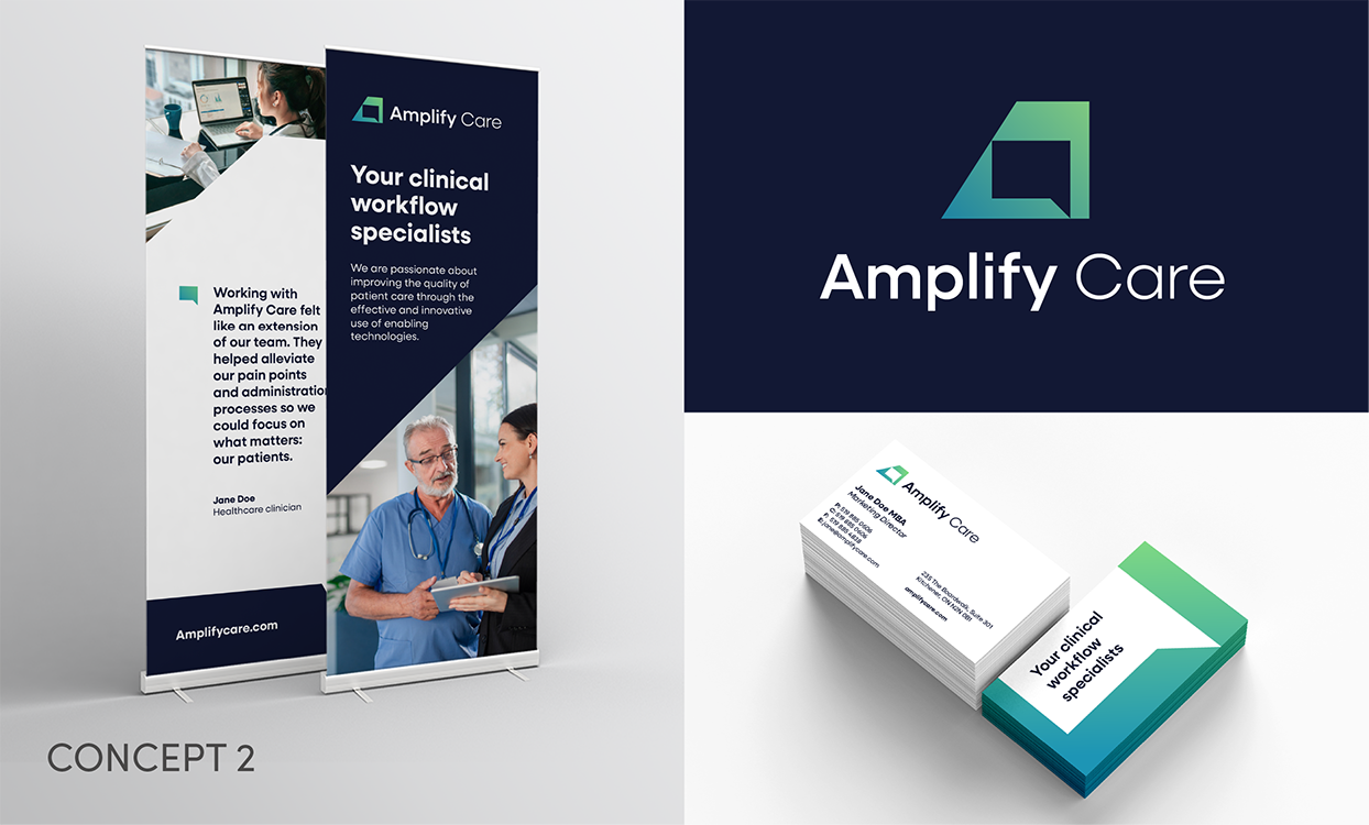
The final identity. An approachable and connected evolution
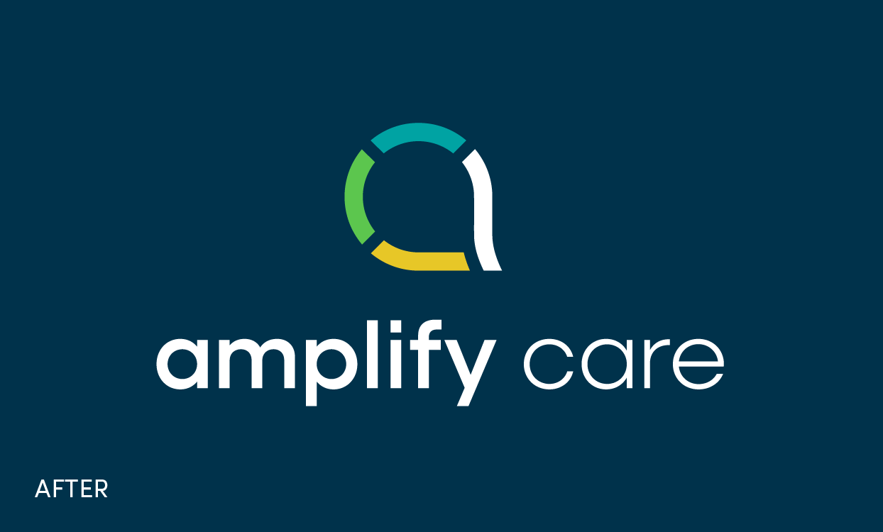
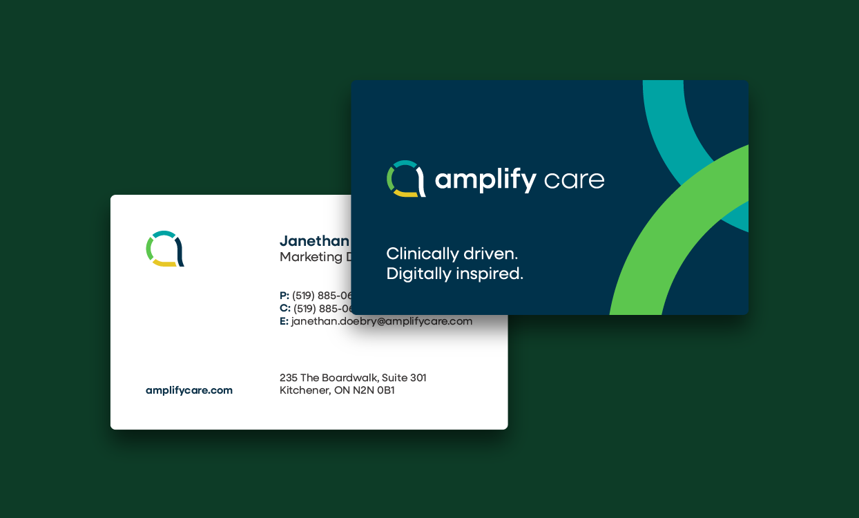
After some refinement and experimentation, the chosen concept features a logo with an icon that combines the shape of a lowercase ‘a’, an abstract speech bubble representing the clinician’s voice, and four pieces coming together to depict teamwork and connection. The movement of the symbol represents flow, growth, and the sharing of information.
The soft curves of the icon shape and the use of lowercase typography help make the identity feel approachable and professional. The colours green, teal, navy, and yellow provide a distinct, modern look that represent key brand attributes such as growth, calm, and trust. Together, these design choices support Amplify Care’s mission to connect and advocate for healthcare professionals through digital health.
Building a cohesive brand system
Beyond the logo, we developed a comprehensive system where each component and decision builds upon the foundation of Amplify Care’s mission, values, and personality, ensuring a consistent and cohesive brand experience.
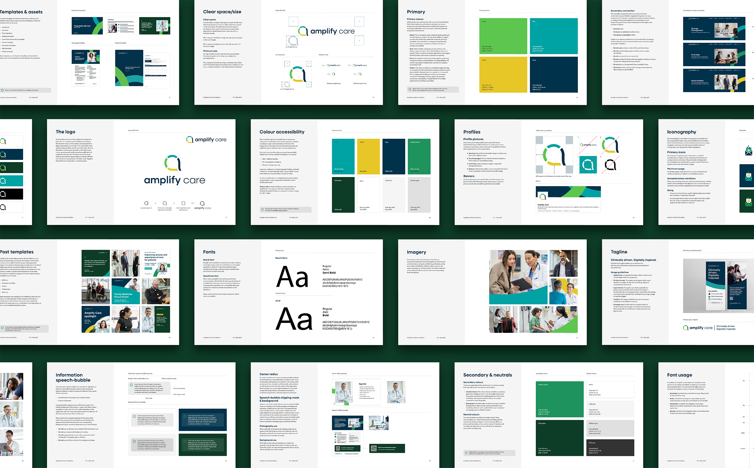
Colour palette
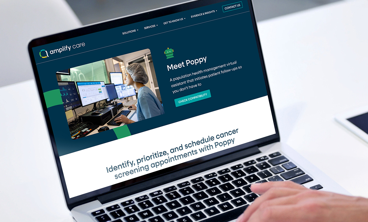
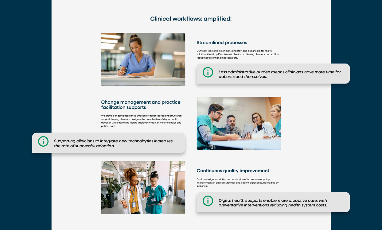
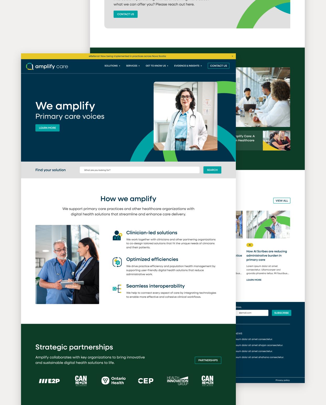
The colour palette for Amplify’s brand combines teal, navy, yellow and shades of green. Each colour is intentionally selected to reflect the brand’s personality while also serving different purposes throughout the brand’s presence, giving it a unique and dynamic persona. Green pays tribute to the organization’s legacy, symbolizing growth and transformation. Teal conveys calmness and balance, representing their role in the healthcare sector, while navy anchors the colour palette, reinforcing the brand’s wisdom, trustworthiness, and dependability. Yellow allows the brand to stand out in the competitive landscape dominated by blues and greens, while remaining approachable and welcoming.
Imagery and brand elements:
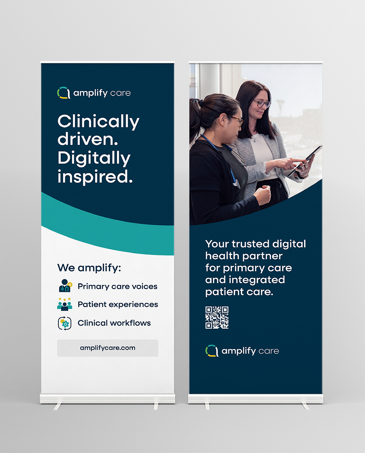
Amplify’s visual expression comprises multiple brand elements that work together to enhance and communicate its purpose, positioning, and values, resulting in a unique and dynamic aesthetic with intention. Such as:
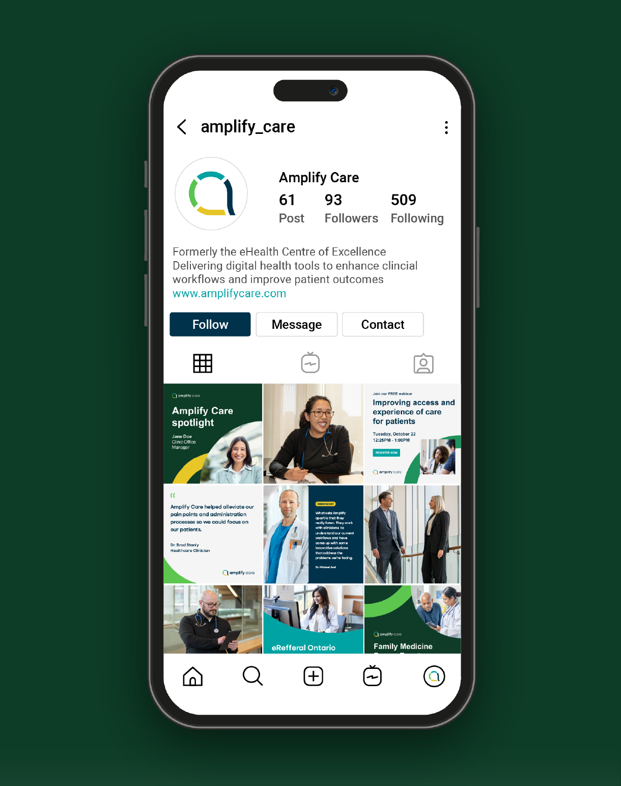
- Two icon styles – A primary set that reflects the logo’s connected visual language and a secondary set for enhancing readability in more functional contexts.
- Connection and support frames – Graphic elements inspired by the logo’s structure that add movement and human focus to layouts, from banners to presentation decks.
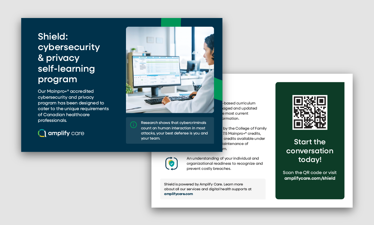
- Authentic photography – Relatable imagery centred around showing clinicians in their work environments interacting with patients, their team, and technology.
- Rounded corners and speech-bubble shapes – Subtle nods to the logo that create a modern, tech-forward aesthetic while reinforcing the core message.
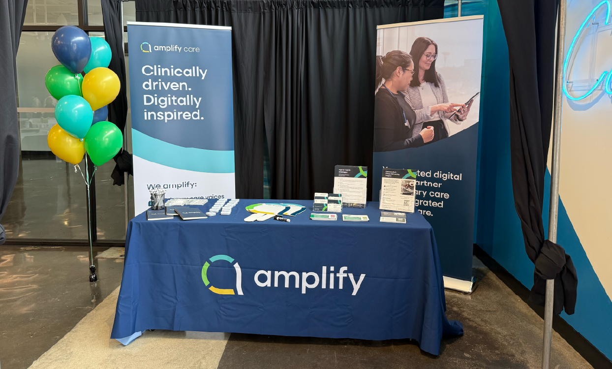
The result and rollout
In addition to the visual identity, we helped ensure a smooth and consistent rollout of the new brand. We created comprehensive brand guidelines that outlined the correct usage for the logo, colours, typography, photography, and imagery, along with examples and use cases.
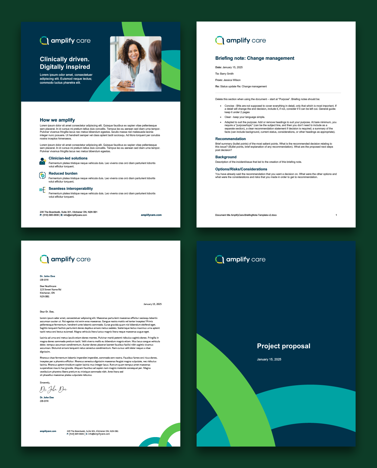
Lastly, we created a launch-ready brand kit that included a library of practical and user-friendly templates and assets, such as letterheads and business cards, email signatures, PowerPoint presentations, one-pagers, project proposals, social media graphics and other relevant marketing materials. We designed each to help the Amplify Care team confidently apply the new brand from day one. By equipping them with the right tools, we supported a seamless transition.
“The feedback we’ve received from partners, funders, and clinicians has been overwhelmingly positive. We’ve heard things like, “Thank goodness,” “About time!,” and “I love the design—it’s so much more modern and reflective of Amplify’s mission.” People have really connected with the story behind the brand.”
Danika Voisin
VP, People & Corporate Services at Amplify