Category
Role
Tools
Team
Client
Helping Tri-Mach stand out against the competition
Tri-Mach has been a leading provider of sanitary stainless steel solutions to the food, beverage, and pharmaceutical manufacturing sectors for over 35 years. With a well-earned reputation for delivering top-quality fabrication and installation services, this case study uncovers how their new website design helped them stand out in the industry, reflect their growth, attract top talent, and highlight their expertise.
A unique design that breaks free of templates
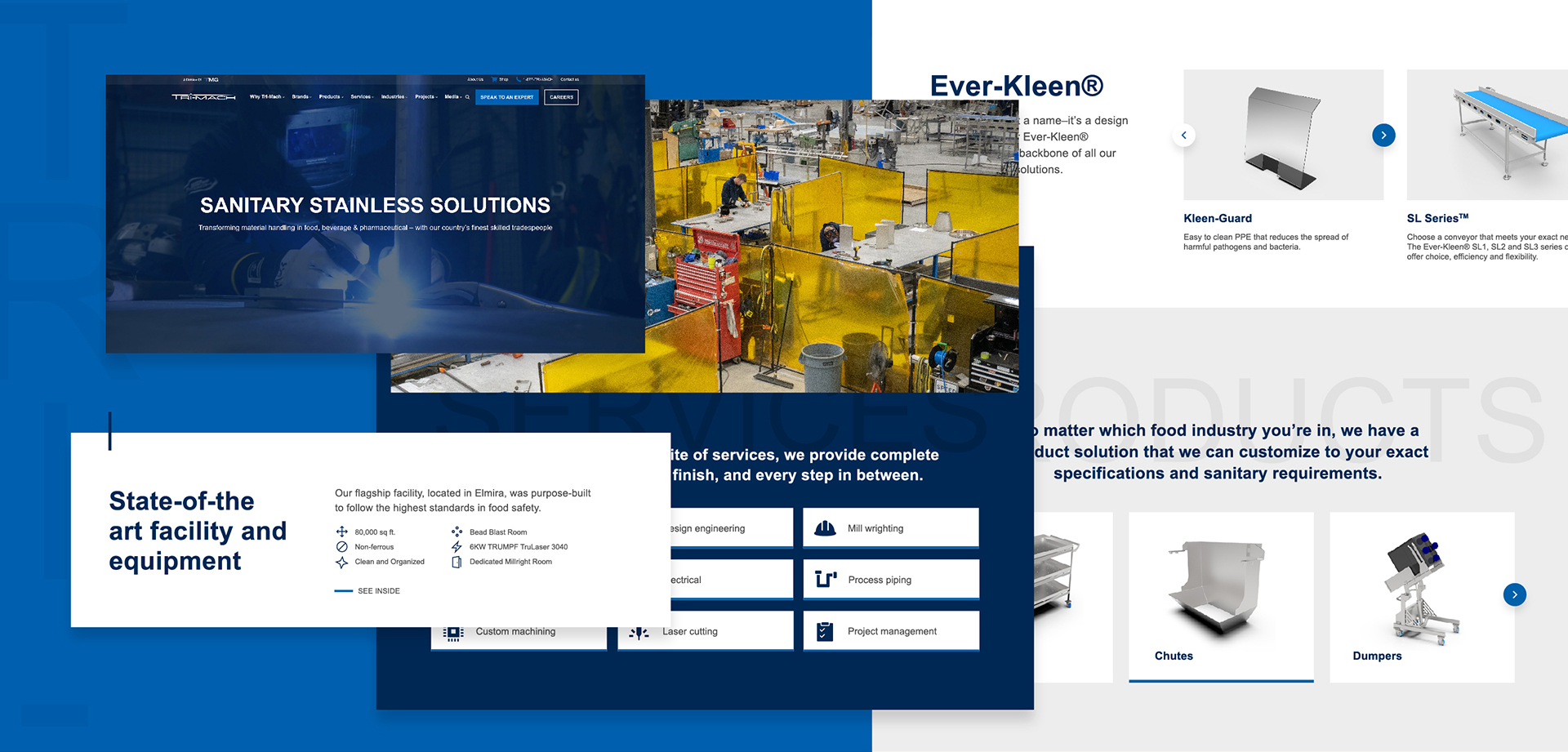
I created a fully custom website design for Tri-Mach that breaks away from their industry’s dull and outdated norm. Unlike the templated solutions commonly used, Tri-Mach requested a modern and creative design that would set them apart from their competitors, and they emphasized the importance of “show, don’t tell,” which guided my approach.
To achieve this, I focused on incorporating large, impactful imagery and punchy typography as opposed to their competitors, who use lengthy blocks of text. The result is an inviting platform that’s easy to skim and effectively conveys the company’s offerings and expertise while allowing their beautiful photography and content to shine. The design intentionally breaks free from the confines of predictable layouts by incorporating overlapping shapes and sections. These elements infuse the website with depth and a distinct aesthetic unlike anything else in the industry. This design choice also subtly references Tri-Mach’s core manufacturing service by feeling like parts stacking or coming together. At the same time, the line accent repeated throughout the site is a homage to the line detail in their logo, which also signifies their precision and leads users throughout the site.

A refreshed colour palette for a clean experience
The colour palette is an evolution of Tri-Mach’s original colours they provided which were dark navy and black. Since these colours were similar in tone, it created challenges for the design where there wasn’t enough contrast or hierarchy between elements. The client also asked that the site be clean and bright. Therefore, I introduced a lighter blue for accents and call-to-actions with white and light grey backgrounds, including extra padding and whitespace to balance the heaviness of the primary colours and prominent photography.
Incorporating white into the palette also serves a dual purpose by communicating sanitation and cleanliness, while the new blue conveys attributes such as trust, dependability, and competence. Making them a thoughtful and fitting extension of their identity since they align with the brand’s core values and services.

A place to showcase their work, expertise, and scale
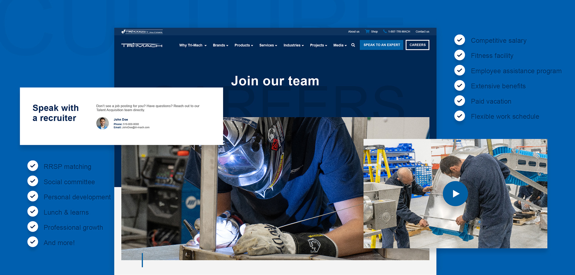
Apart from standing out, the redesign highlights their talented team, work, qualifications, scale and technical expertise by prominently featuring their flagship facility on the homepage using large images and facts essential to potential customers with a call-to-action to watch a video inside their facility, in addition to restructuring the user experience of their project page to help prospects browse relevant work through filters and keyword searches.
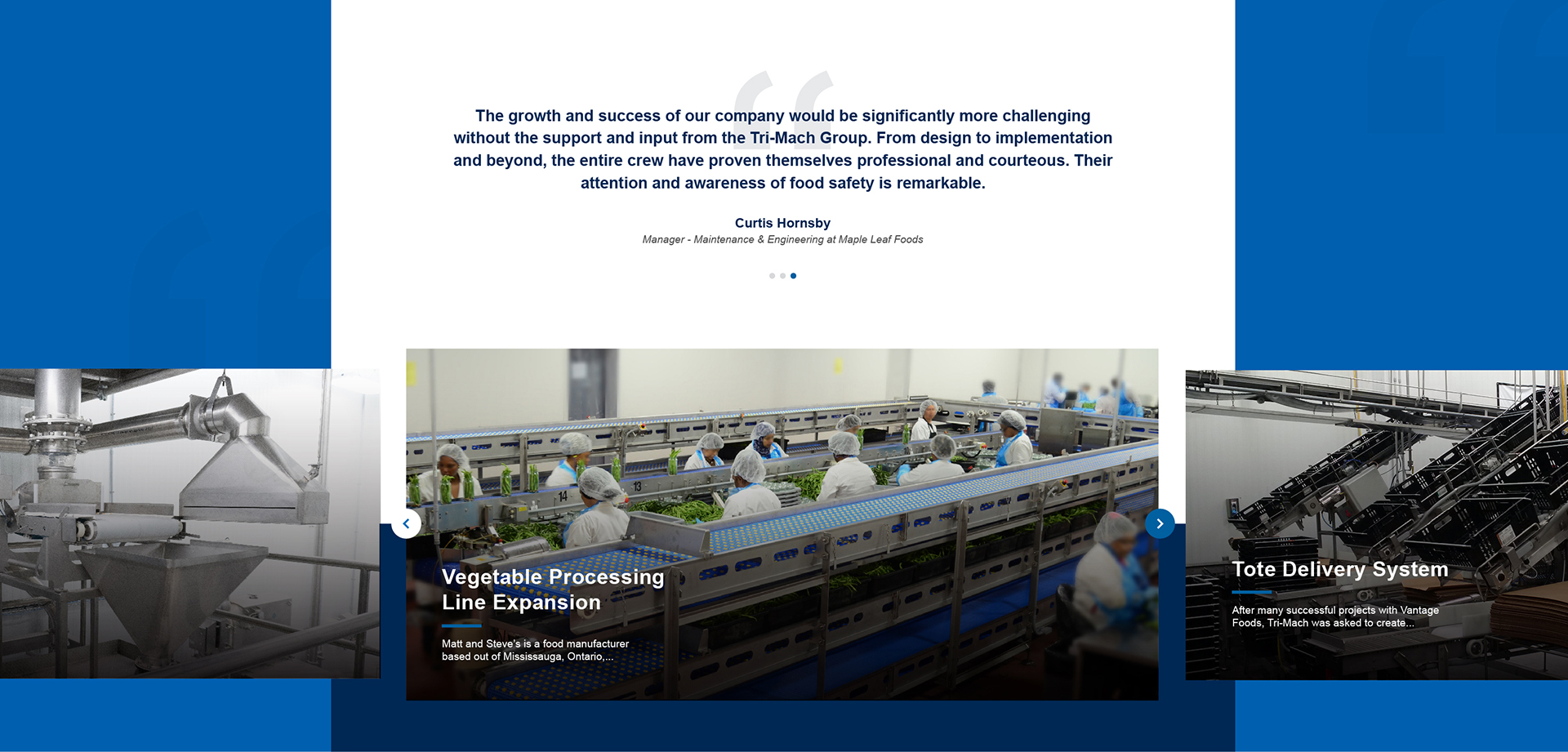
To further reinforce their expertise, the website strategically integrates social proof, including client testimonials, awards, recognitions, and logos of industry-leading brands they work with, seamlessly across the site, on top of their ‘Why Tri-Mach’ page, which outlines their team’s extensive certifications and affiliations.

Easy to digest mega menu
Since Tri-Mach’s services and products are expansive, it was essential to organize them so that visitors could quickly see the full range of their offerings and find what they were looking for. Therefore, we opted for an organized mega menu with representative icons and images, making navigation easy to digest and more engaging.

Intuitive forms for better lead generation
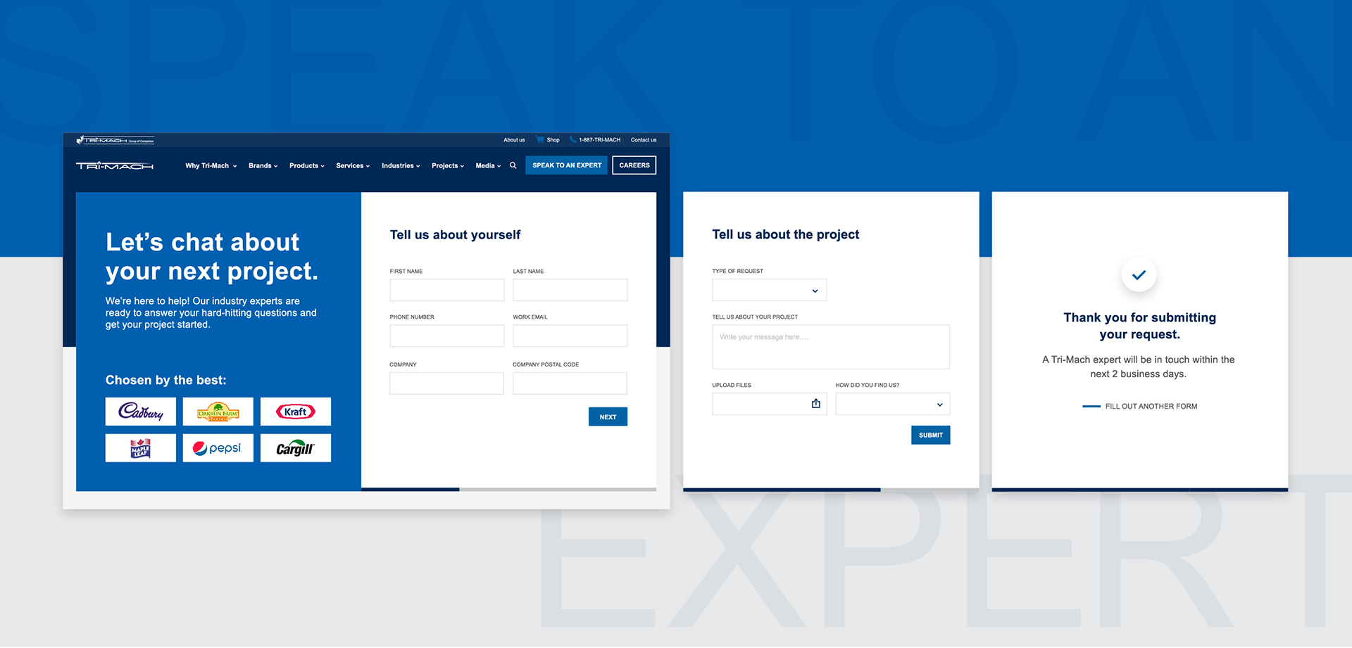
Considering Tri-Mach’s services and products are more than one-size-fits-all, they needed it clear that future customers could reach out for more information or a custom solution. Therefore, an eye-catching button labelled “speak to an expert” was introduced to the website’s primary navigation for convenient access regardless of where they were in their exploration. Then, once on the ‘speak to an expert’ page, prospects can complete an intuitive form gathering vital information for Tri-Mach’s sales and marketing team, including an option for media to be uploaded. The structure was also intentionally broken down into smaller parts with a progress bar to make it look more manageable to prospects and deter those not ready to commit, resulting in more serious leads.
The result was a new standard in the industry
Tri-Mach’s new website is a testament to the power of strategic and creative design in transforming a brand’s digital presence. By breaking free from the industry’s standard templates and embracing a custom approach, we’ve created a platform that not only highlights their expertise and quality but also engages potential clients and top talent. The modern design, combined with a refreshed colour palette and user-friendly features, ensures that Tri-Mach stands out as a leader in the sanitary stainless steel solutions market. This project exemplifies how thoughtful design can reflect a company’s growth, values, and vision, setting a new standard for the industry.